How I led design sprints to improve search at Oracle
Case Study | Leo Vroegindewey | 2019
Highlights
- I was one of two Senior UX Designers that touched the majority of Oracle’s brand and creative UX efforts from 2017-2019. This provided me a unique and in-depth look at Oracle.com’s information architecture and how to use webpages and design patterns effectively.
- Our wireframed prototype was shown to sales teams, customer service teams, brand teams, and product designers embedded within the product teams.
- We focused on building a UI shell or container that would work across all devices and also house all of Ask Oracle’s functionality without overwhelming the user.
"Leo is adept at synthesizing user needs and business objectives and translating them into logical and meaningful user journeys."
Tor Gilbertson – Oracle, Sr. Front End Web Developer
Introduction
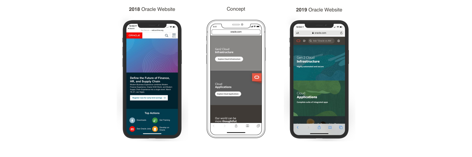
The Oracle.com website receives tens of millions of visitors every year who are looking for something specific. Because Oracle offers so many products and services, navigating the site to find what you seek becomes challenging. Presently, the website has many different navigation means: 1) the universal menu, 2) the local menu, 3) the chat function, and 4) the search function. The Ask Oracle shell could replace the myriad ways visitors can navigate with one universal start page powered by search. It will be a personalized search start page to enable expedited navigation on Oracle.com.
This project aimed to design the Ask Oracle user interface concept to sit on top of the Oracle.com website and act as a gateway that quickly funnels users to their destinations. The focus was helping users find their information fast. Once they had found their content, they could navigate and complete their tasks. .
Problem definition
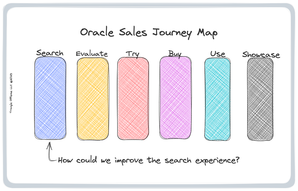
I prepared a “How Might We” exercise in which the team and I looked at the result when a user utilized Ask Oracle to search for content on Oracle.com. This exercise required asking questions about how the project could be successful as well as figuring out who talks to our customers the most. Lastly, we discussed how Ask Oracle would work—the technical requirements and constraints were important because they would direct our ability to wireframe certain solutions.
Goals:
- Build version 1 of the Ask Oracle shell.
- Make sure Search becomes front-and-center as customers navigate and complete tasks on Oracle.com.
- Address current visitors’ pain points.
Additional:
- To be helpful for the user, a search function must be front-and-center and should be necessary to retrieve the correct content rapidly.
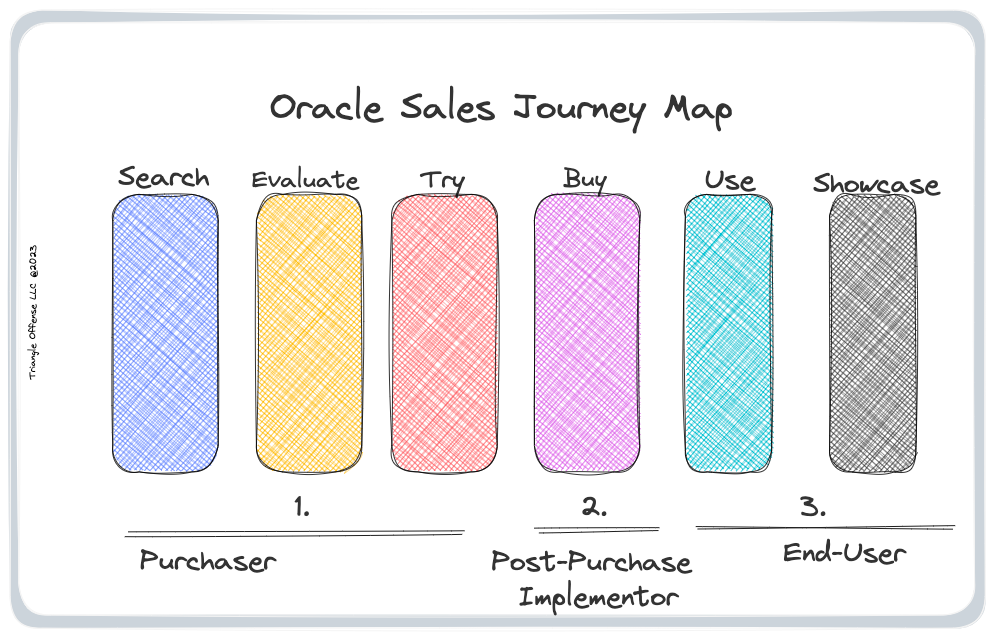
- We uncovered three universal personas; purchaser, implementer, and user, and we refined them later as we took a closer look at them.
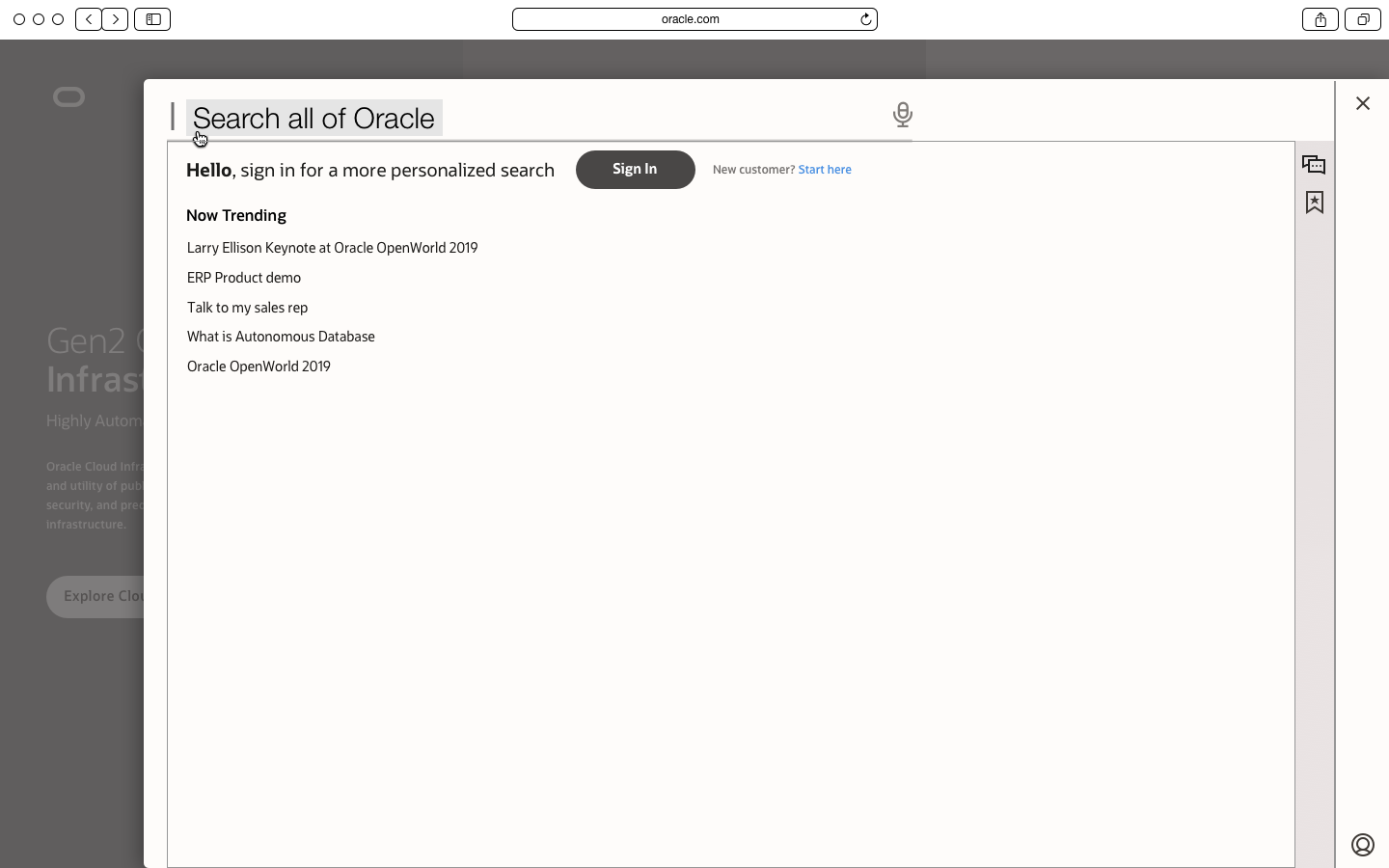
- As users click on the search bar and start typing their questions, the autocomplete results should show up right below the search bar, allowing users to click on the result they want.
- The user then clicks on the auto-completed search result, which could be a web page showing the latest product content or a specific task that the user regularly completes.
Intake and discovery
We learned we had to focus on three archetypes: 1) a purchaser of a product/service, 2) a post-purchase implementer, and 3) the product's end user. Different business units contributed to this research by providing feedback on who their customers were and some of their pain points.
Insights:
- Users who are searching for a solution to a problem they are experiencing are most likely not the ones implementing the solution.
- Users who implement the solution will not always be the end users of the product they are installing.
- An end user is not necessarily involved in the buying/implementation process and may require different Oracle services.
- Oracle employees would also use the Ask Oracle shell to interact with customers, which would be a significant change from how they currently communicate with their customers. The Ask Oracle shell would enable us to position Oracle much closer to the customers and cater to their needs.
Customer sales journey
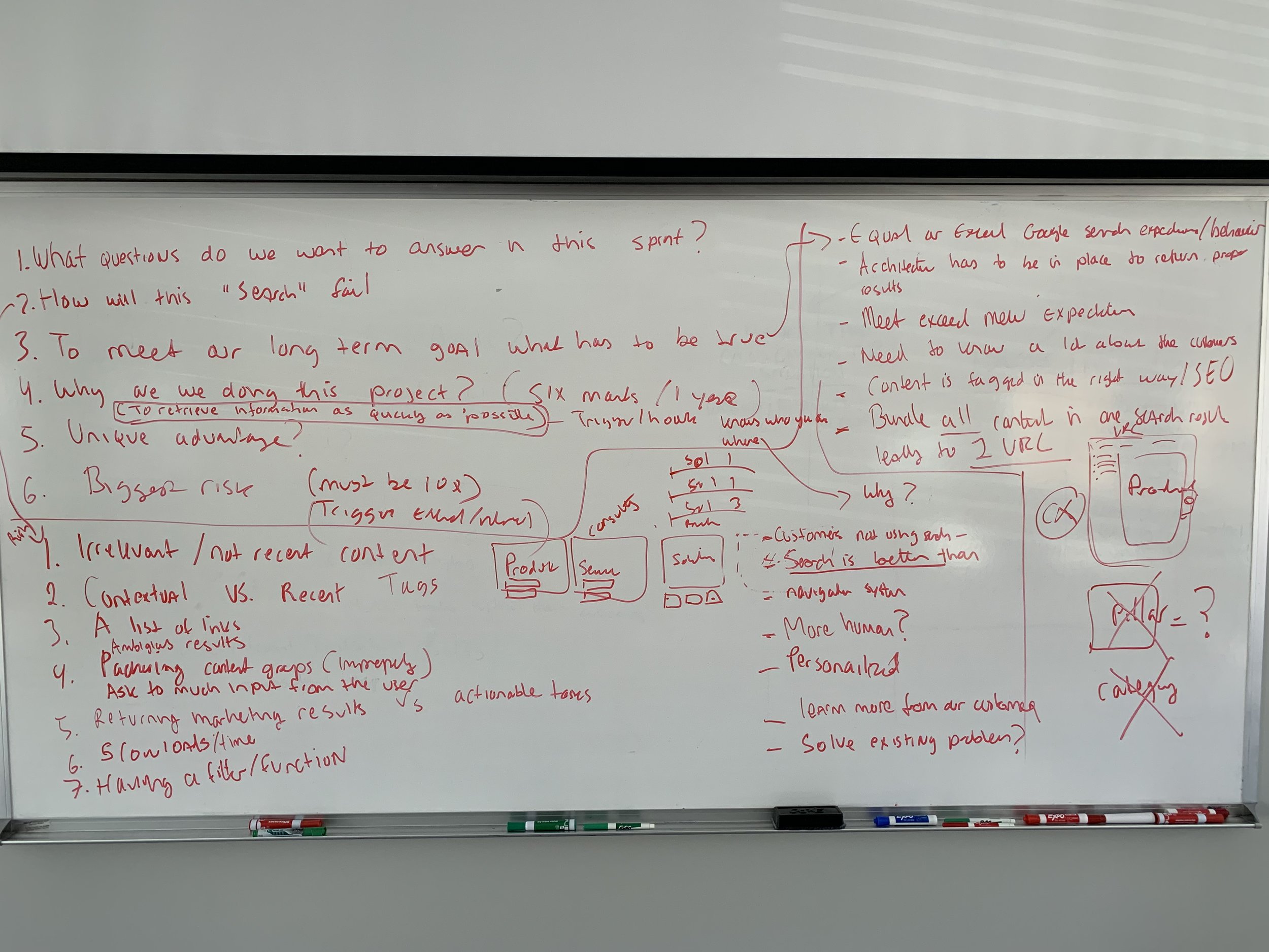
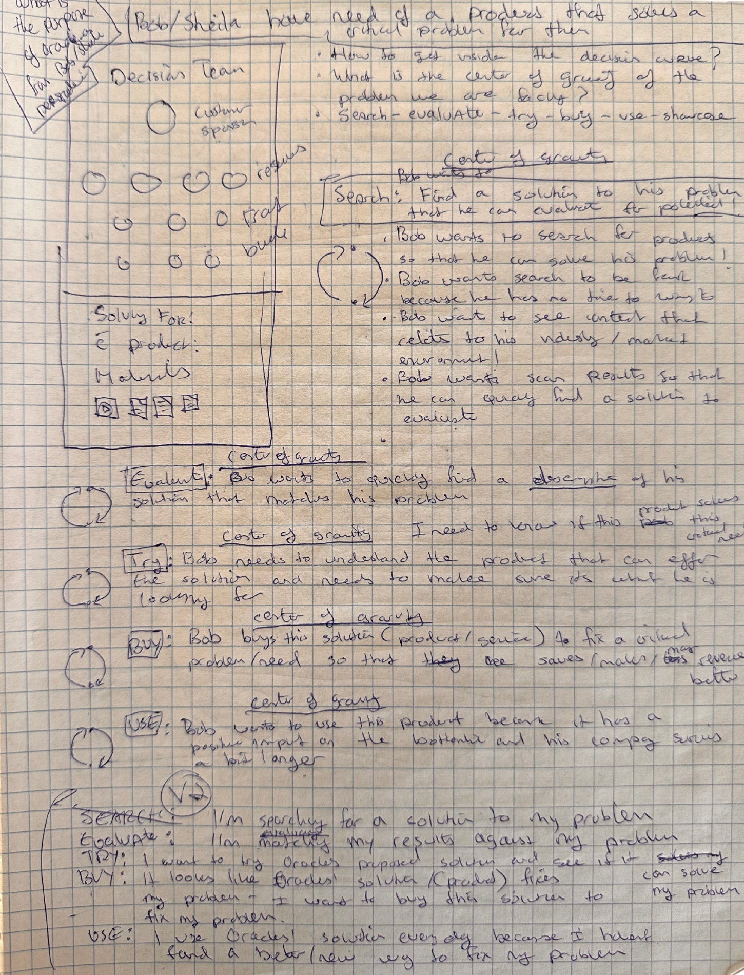
I wrote out several bullet points for some of the sales journey map stages that would anchor my design sprints. I called each bullet my center of gravity.
I made up this character called Bob and stated that "he has need of a product that solves a critical problem for him."
Search: Bob needs to find a solution to his problem that he can evaluate for potential!
Evaluate: Bob wants to quickly find a description of his solution that matches his problem.
Try: Bob needs to understand the product that offer the solution and needs to ake sure it's what he is looking for.
Buy: Bob buys the solution (product/service) to fix a crucial problem/need so that he saves/makes/revenue.
Use: Bob wants to use this product because it as a positive impact on the bottomline and his company survives a but longer.
Showcase: I did not write a description for this stage, but I recall it had something to do with showing off the win inside Bob's organization.
User Flow Diagrams
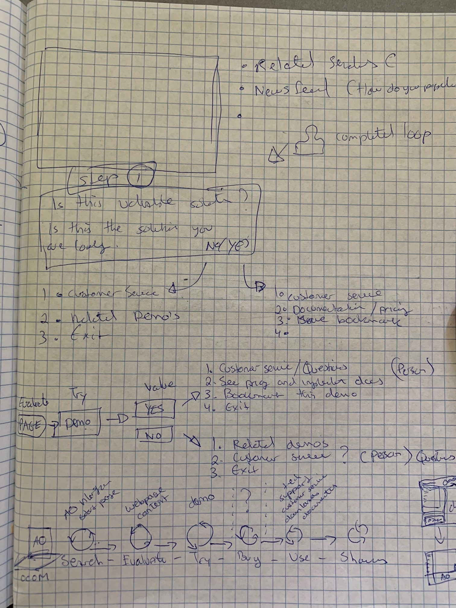
Next I created different user flows for all the Ask Oracle shell’s main features.
Insights: Besides giving me a greater appreciation of what was required to wireframe, this process allowed me to understand each step a user must undertake to use the Ask Oracle shell’s different features.
- A universal sales journey includes the following steps: 1) search, 2) evaluate, 3) try, 4) buy, and 5) use a product or service.
- I mapped the functionality of each step in the customers’ user flow to ensure we could pull them along to complete their journey.
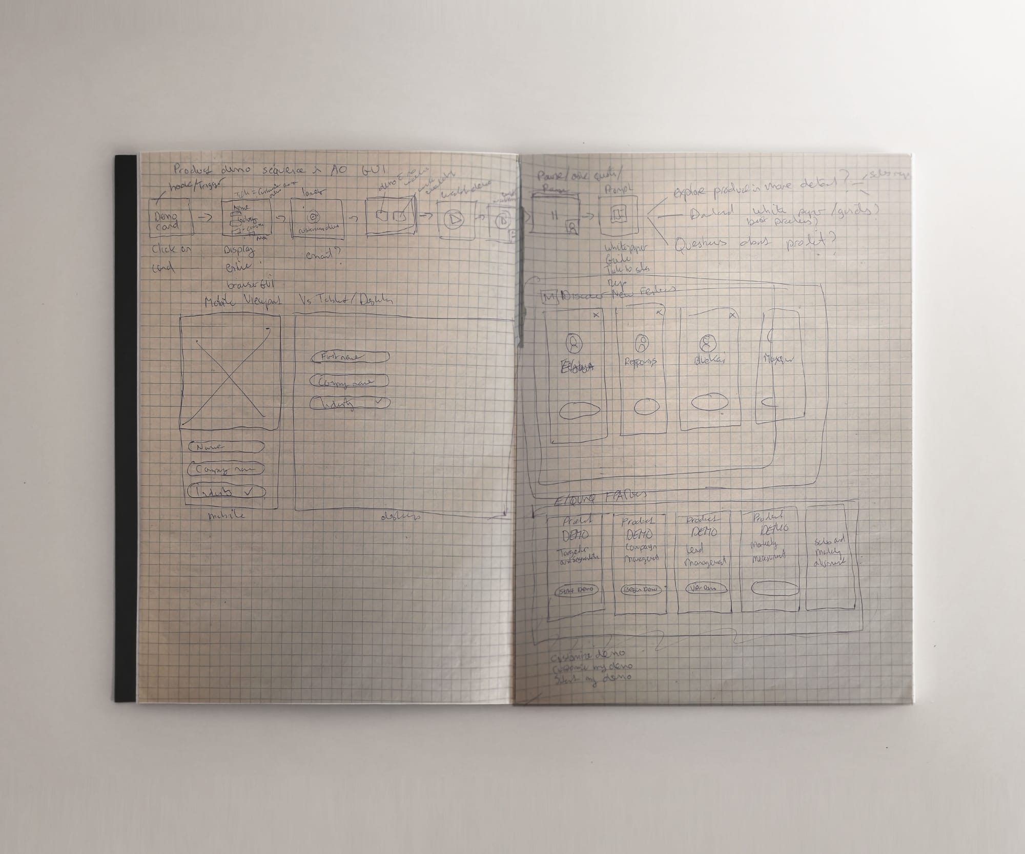
Automated product demo customer flow
For the try stage of the sales journey I was obsessed with ideating on this concept that I had been mulling over for a while.
How could I capture a prospects email, then contact them a day later and show them a product demo that had their relevant data displayed to make the sales demo a lot more personalized. When you run design sprints, nothing is off limit and you have to push the envelope to look for new capabilities that move the needle.
Sketching
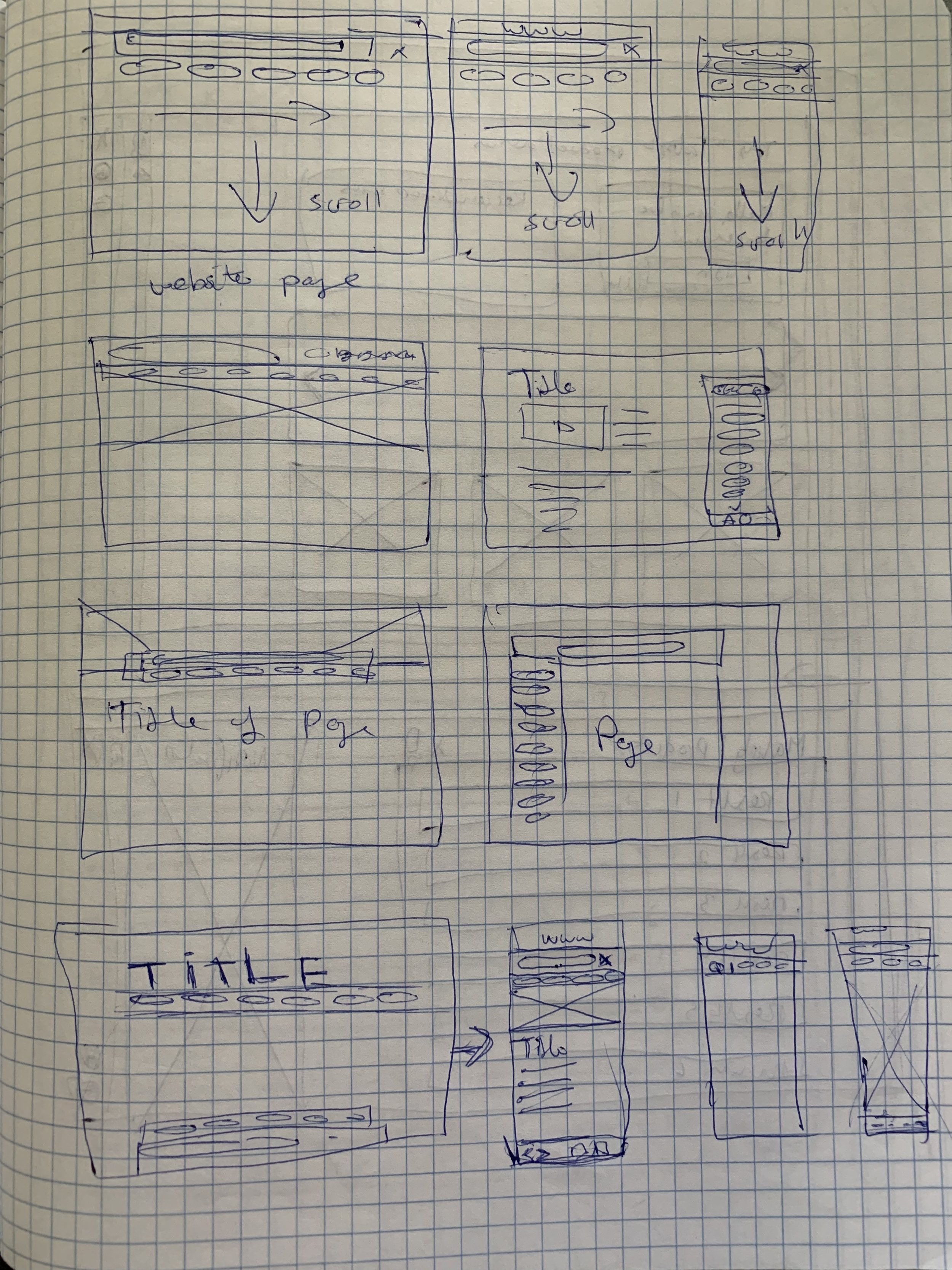
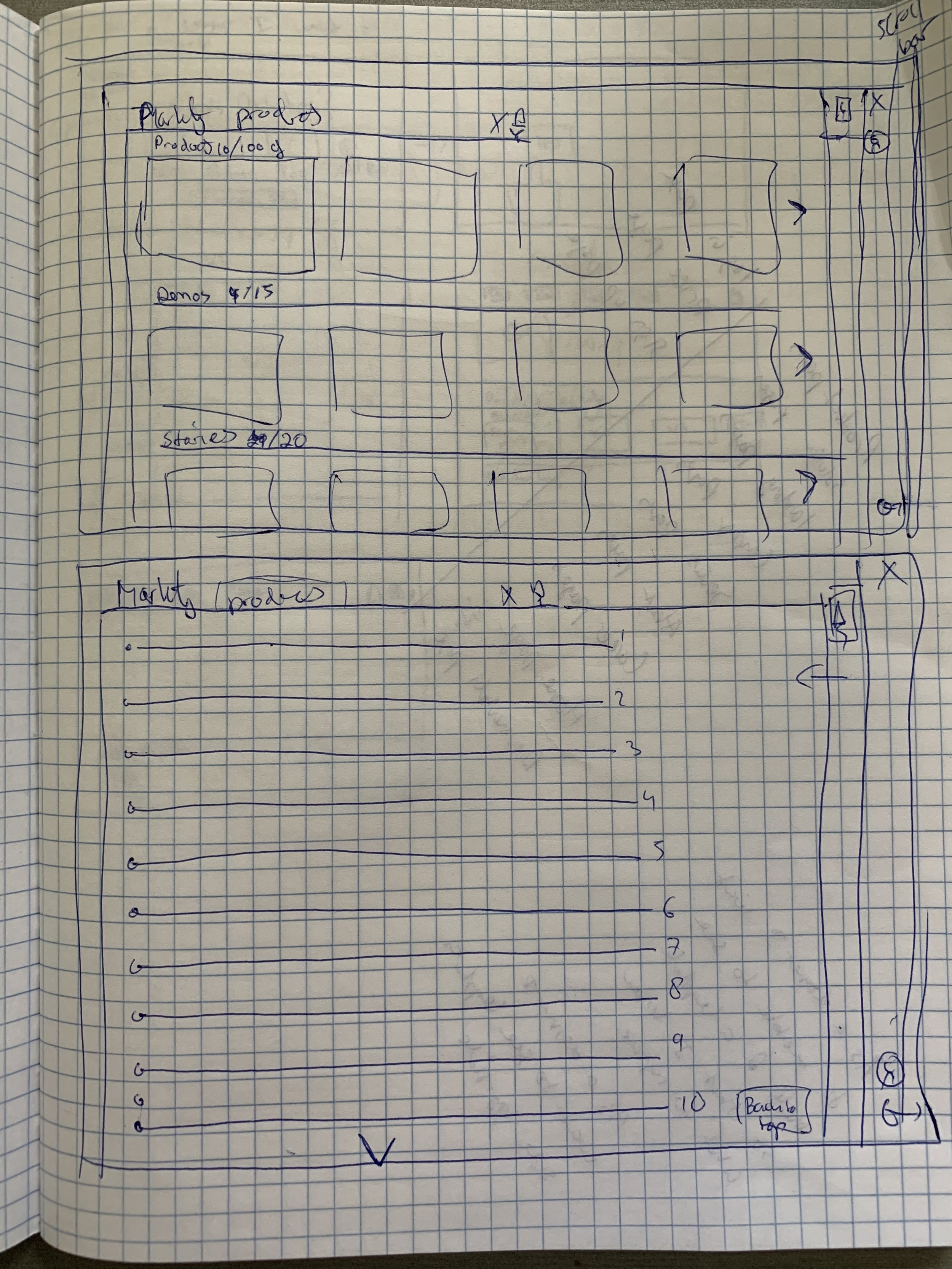
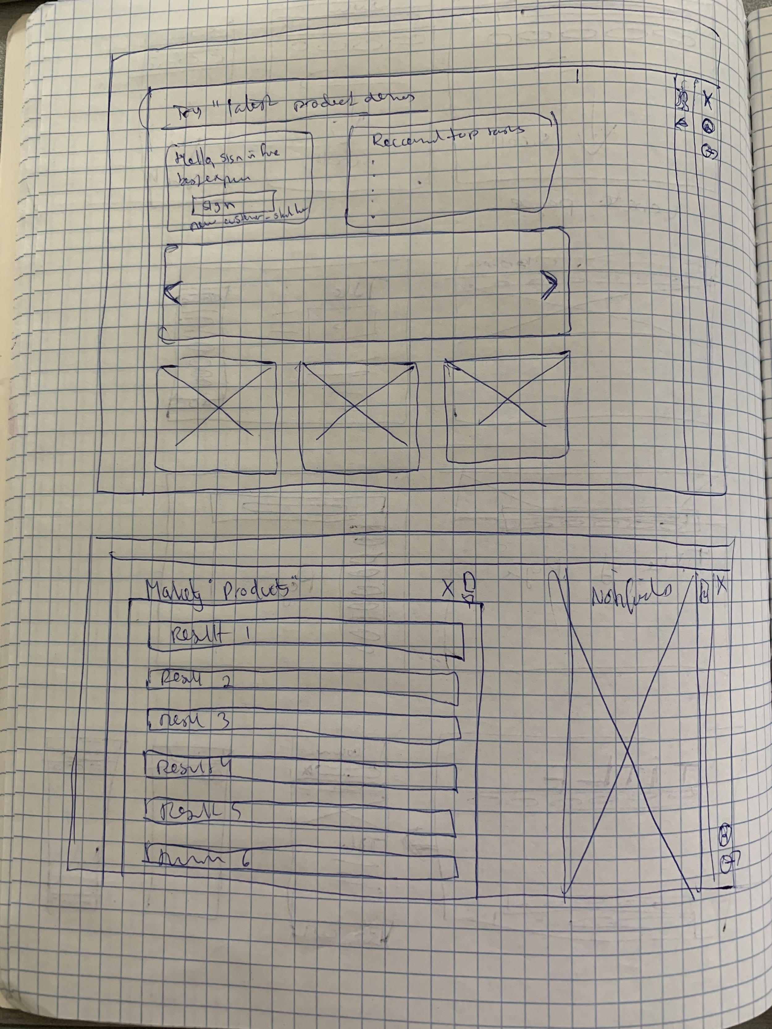
The Ask Oracle shell’s start page needed an incredibly simple layout and functionality. I focused on displaying the following capabilities:
- Search
- Search results,
- Logged-in/out state,
- Services,
- Profile
- Notifications
Insights:
- The Ask Oracle widget must sit on top of an Oracle.com web page.
- When the user starts a search, they click on the Ask Oracle widget, which opens the Ask Oracle page that allows them to search the website.
- Through sketching, I understood what the layout would look like on a website and mobile screen. I also learned that using cards to store information would be the optimal way to show search results.
- The shell would display a search bar at the top and a menu bar at the bottom of a mobile screen. After sketching out several variations, this layout appeared to be the most effective, which users who reviewed the wireframes later confirmed.
Wireframing
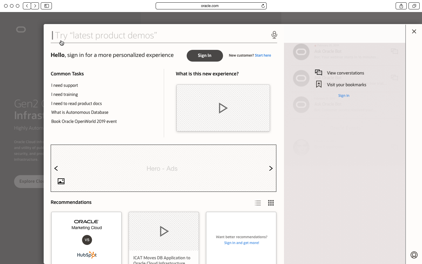
We needed to account for several things while wireframing the Ask Oracle shell. For instance, based on my requirements, I wireframed a trigger that would sit on an Oracle.com webpage. That trigger would open the Ask Oracle shell’s start page. Once users were on the start page, they could start typing their questions, and a search result would appear. Users then click on the search result and are sent to a webpage.
Insights:
- I questioned where the Ask Oracle trigger/widget would sit on a desktop viewport versus a mobile viewport webpage. After trying different layouts, I focused on placing the widget in the top right corner.
- I also wondered what to show on the Ask Oracle shell’s start page, and decided the search capability would be front-and-center at the top of the start page. Cards displaying various pieces of information (based on business requirements) sat right beneath the search bar.
- I learned that showing a search result as a text hyperlink was less than desirable, so I opted to show cards instead. Seeing too many text links would overwhelm the user. With cards, we could provide contextual images or videos to assist the user in finding content.
Feedback sessions with users
We solicited feedback from Oracle employees who would use the Ask Oracle shell functionality in customer service, sales, sales engineering, and other teams. In two sessions, five people were asked to provide feedback on our wireframes. Below are some of the wireframes we used to collect feedback.
Insights:
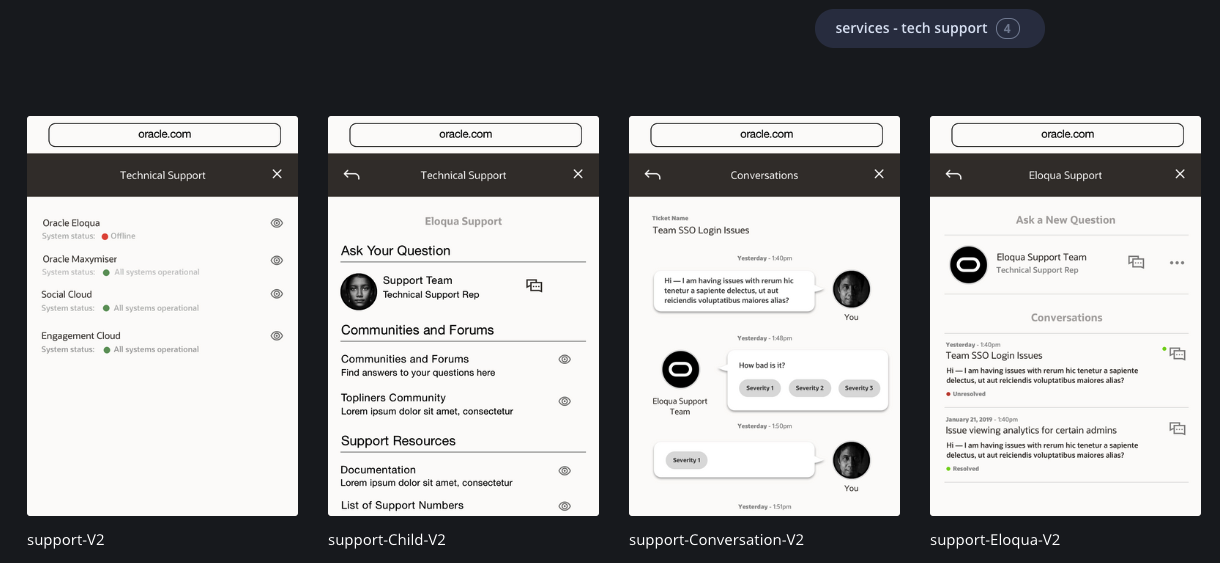
- A customer service representative pointed out where we could simplify the tech support wireframes’ layout. Based on that feedback, we focused on the most valuable functionality and eliminated some of the lesser priorities. For example, it was more important to focus on features related to customers’ SLA and their ability to interact with customer service reps and ask them questions quickly and efficiently.
- The sales team members also provided feedback on our product demo wires and other service features, which helped us shape our user flows and focus on what would provide the most value for our customers.
Highlight #1 Ask Oracle shell menu
Alignment
- The design concept showed it was possible to unify all 14 Oracle domain menus into Oracle.com.
User Problems
- “Your navigation is confusing.”
- “It’s easy to get lost on your website and hard to find the right content.”
Business Requirements
- Consolidate all the Oracle websites and domains to improve organic search.
- Reduce multiple logins to one login.
Highlight #2 search results
Alignment
- I designed the search results to be displayed as card objects that can easily be shown in different viewports and make it simple for users to scan them.
- The solution is designed to show only relevant results.
User Problems
- “I need assistance to determine which set of services can help my company achieve our goal.”
- “My trial experience sucks; product demos need to show me how Oracle’s products work.”
- “Content is all over the place; looking for one-stop shop; there is too much content.”
Business Requirements
- Unify all the domains to improve organic search.
- Improve global site performance.
Highlight #3 QR code scanner
Alignment
- Connect Oracle sales reps with potential customers and vendors directly, in the same conversation.
- Make connections a central meeting point (not email or other channels), which ensures direct contact.
User Goals
- “I need to find out about very specific use cases, for example, migration to the cloud and how Oracle solves that for me.”
Business Requirements
- Fix inconsistent and non-intuitive inbound/contact experience.
- Focus on pre-purchase and post-journey, ensuring that our digital presence supports the customer through that journey and meets their needs along the way.
- Seize the opportunity to provide more transparency about what to expect as an Oracle customer (e.g., pricing, time, and path to realizing value, etc.).
Highlight #4 technical and customer support
Alignment
- The concept provides the ability for the user to tap into technical support for their product.
- It does not require users to log into other websites.
- It combines technical support with customer support in one channel.
User Goals
- “I need support for the products I already own.”
- “I want to access my services through my sign-in.”
Business Requirements
- Providing all the support in one domain is essential.
Reflections and details
- The most important skill I practiced during this project was learning how to run a design sprint. Later on, as a Lead Product Designer at Lowe's, I used the knowledge gained during this project to lead a large and complex project delivering a target state using design sprints.
- Through the right methodology and process, a small group of experienced designers quickly finds out if a new concept will provide value to its users and their organization.
- Google Venture design sprints were effective. However, we adjusted the process to fit within our organization and constraints and leveraged the best learnings from multiple processes to achieve alignment. We leveraged our cross-organizational relationships with the sales and customer service teams to collect feedback on our wireframes in every design sprint.
- Our conceptual work influenced the redesign of Oracle.com, specifically the global menu that served as the entire website’s main entry.
- Our exploration highlighted several risks. For example, returning results as text would be difficult to scale; displaying results in a card container with the text and image would offer a scalable solution, thus searching the primary way to complete tasks versus using a global menu.
- Our conceptual work focused on experiences that achieved alignment and provided value to Oracle customers and the business teams. For example:
- Engaging with interested customers at Oracle Conferences.
- Providing customers with quicker and more transparent service resolution.
- I used the Ask Oracle shell concept to provide a simplified way for users to find and complete tasks rather than clicking through countless menus and screens.
Type: Responsive Web Design
Date: January 2019 - March 2019
Company: Oracle
Role: Senior UX designer
What I Did: Interviews, user research, personas, user flows, information architecture (IA), concepting, wireframing, prototyping, user testing, and design sprints.
Team: Oracle Brand & Creative
Team members: Senior UX designer, front-end engineer
Tools: Sketch, Invision
Workshops: Design sprints.
Get in touch
Thank you for visiting my case study. Please contact me if you want to discuss any of my case studies and see an opportunity to work together.
I'm Leo, the writer behind The Triangle Offense blog. Diving deep into UX, CX, and customer-centric business strategy, I provide insights into using timeless CX and UX techniques to attract and retain customers to unlock business growth. Join me on this journey, and let's reshape how to grow a business together.