How I built an iOS app for construction workers
Case study | Leo Vroegindewey | 2013 - 2016
Highlights
- In 2014, I launched the first iOS health and safety app for the oil and gas and construction industries in the North America Apple app store.
- I built the first construction app that successfully and repeatedly synced data when the app was offline or in poor network coverage areas in Canada.
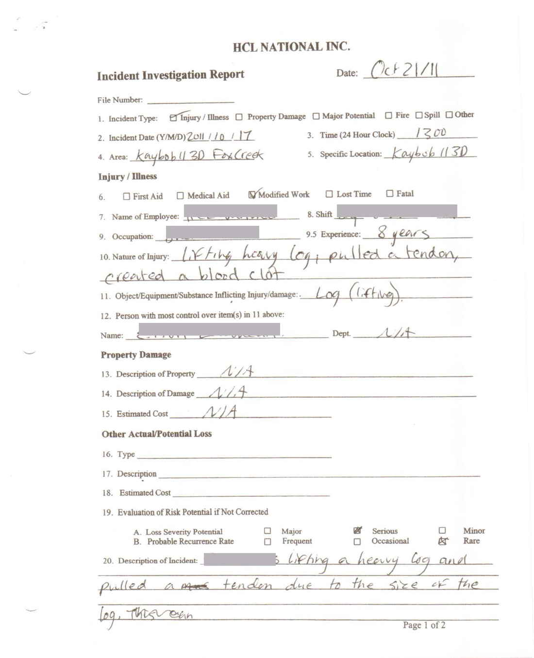
- I built a field incident report form that could be used for insurance claims.
- The Virgin Galactic health and safety team successfully trialed the app. However, they could not sign due to DOD national security requirements.
- The app reduced paperwork completion times from 20 minutes to two minutes.
Users commented that the app was incredibly easy to use and one of the most user-friendly business apps with which they had worked.
Introduction
While working as a health and safety consultant in the oil and gas industry, I witnessed a mulcher fire that could have led to severe operator injury and even started a forest fire.
After witnessing that incident, I was inspired by the idea of replacing all required health and safety paperwork with a mobile app.
I knew that every company is legally required to have an occupational health and safety program that monitors their employees’ safety and well-being. To stay compliant and obey the law, oil and gas companies had their employees fill out copious paperwork.
The app I wanted to design was for field workers in the oil and gas industry. The idea was that they could complete their paperwork in remote rural areas without cellphone coverage. The hard part about creating the app was taking complex, government-mandated paperwork and creating a user-centric mobile experience.
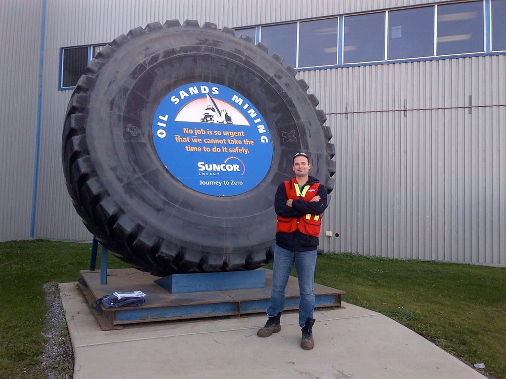
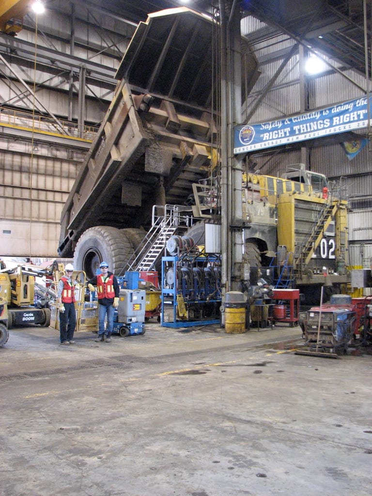
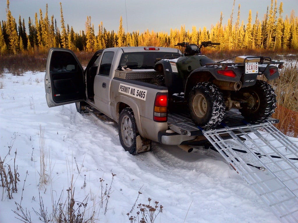
I started working in the oil patch in Grande Prairie, Alberta, in 2005 and left in 2016.
The incident
In the abovementioned incident, a piece of equipment caught fire. The operator jumped out with only seconds to spare, and we were lucky it didn't cause a forest fire.
The ramifications of this episode could have been quite severe for the project managers and the company running the project.
This incident jump-started me on a path to building an iOS app for workers to complete forms out in the field.
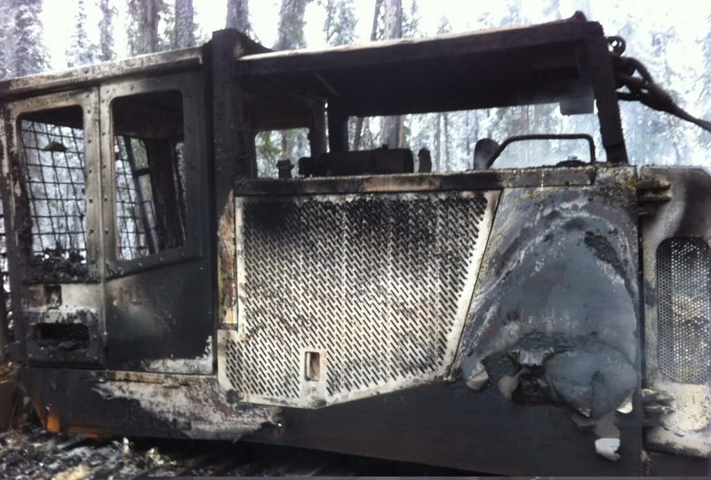
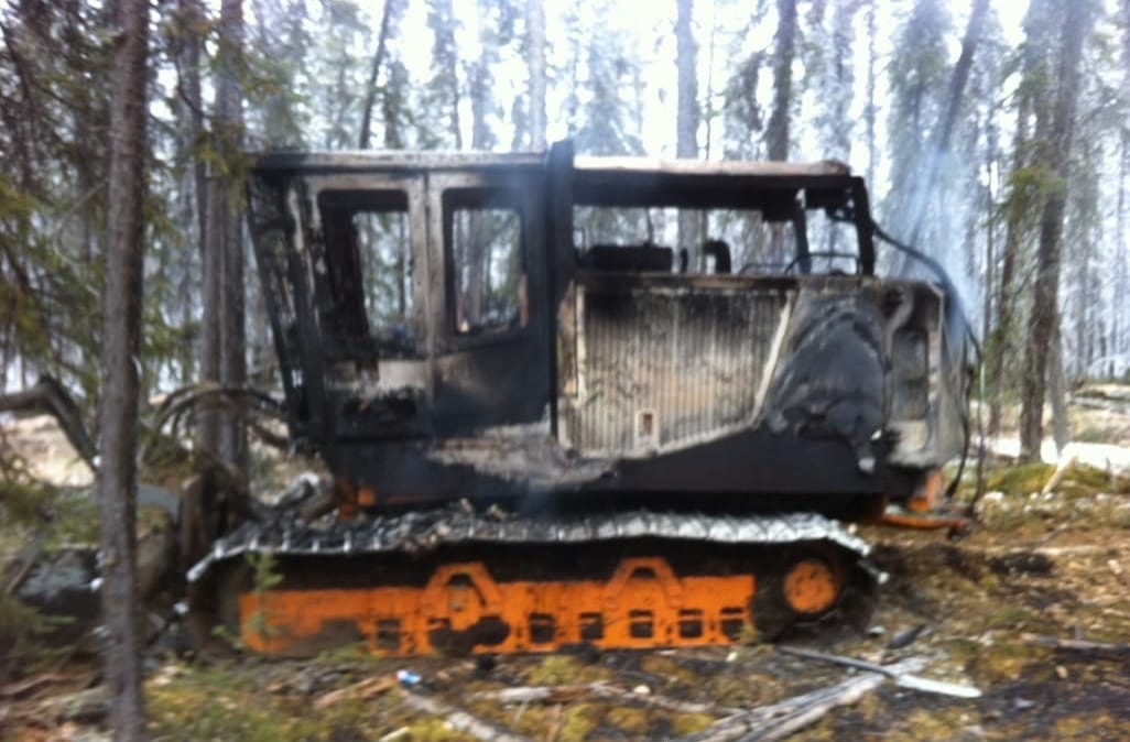
The mulcher fire that started my journey of building an app.
The problem
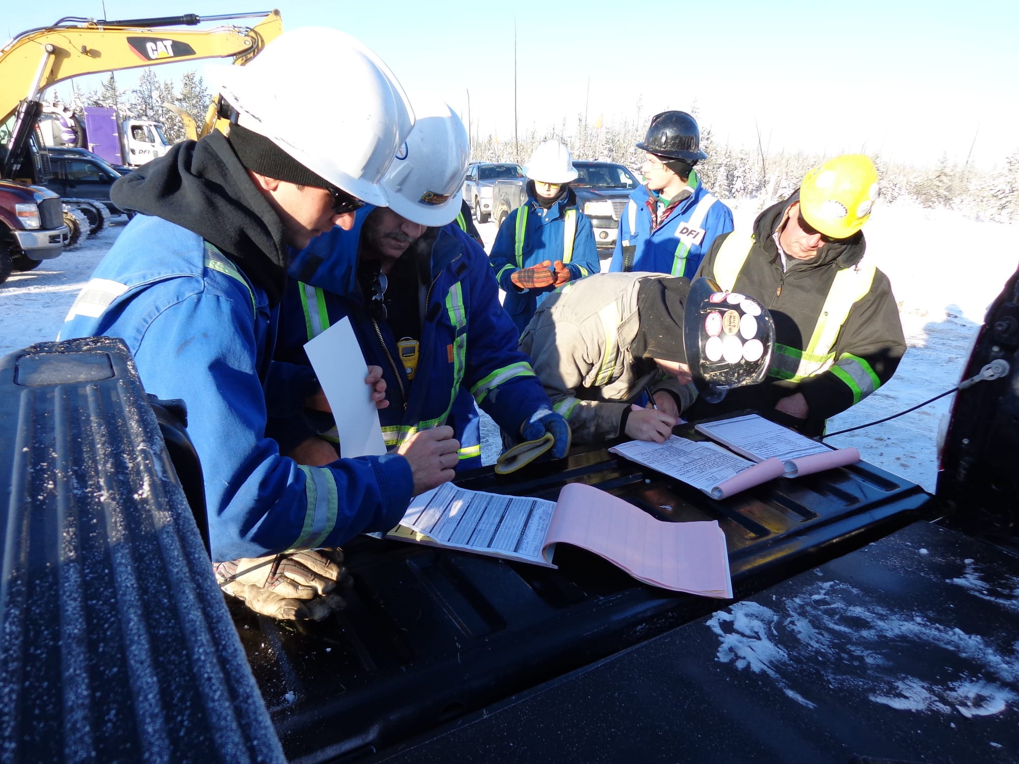
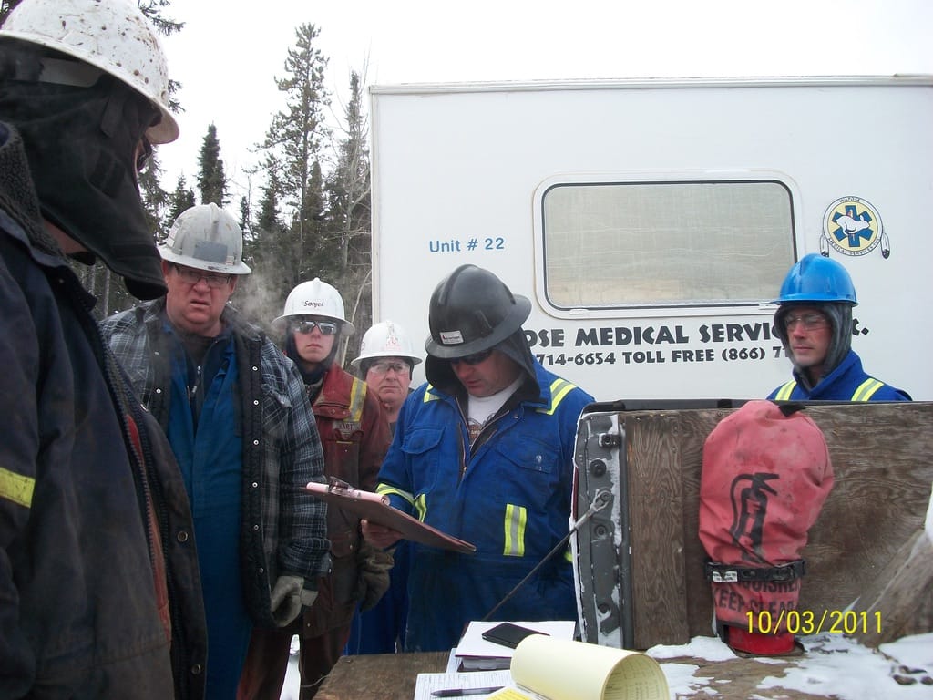
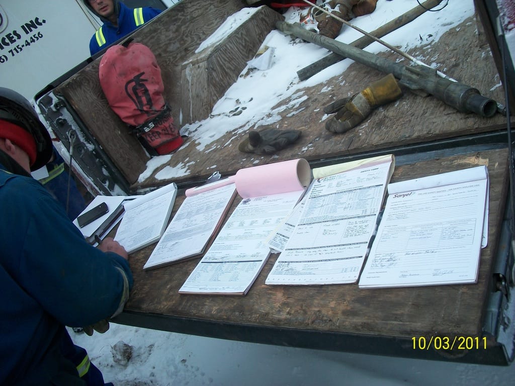
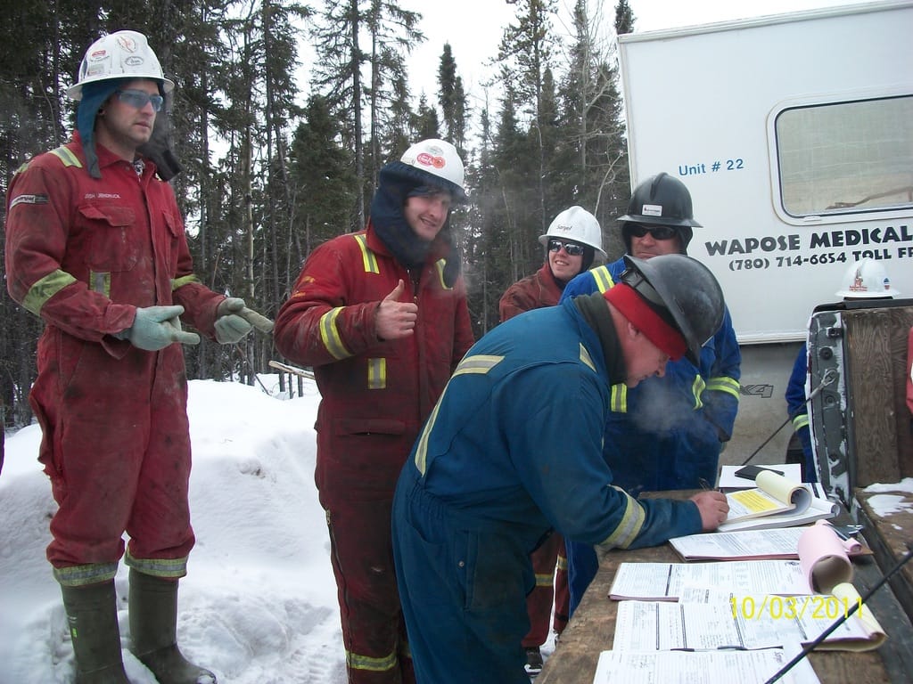
In 2013, the Canadian oil and energy industry's health and safety compliance documentation was primarily paper-based, which led to the following problems:
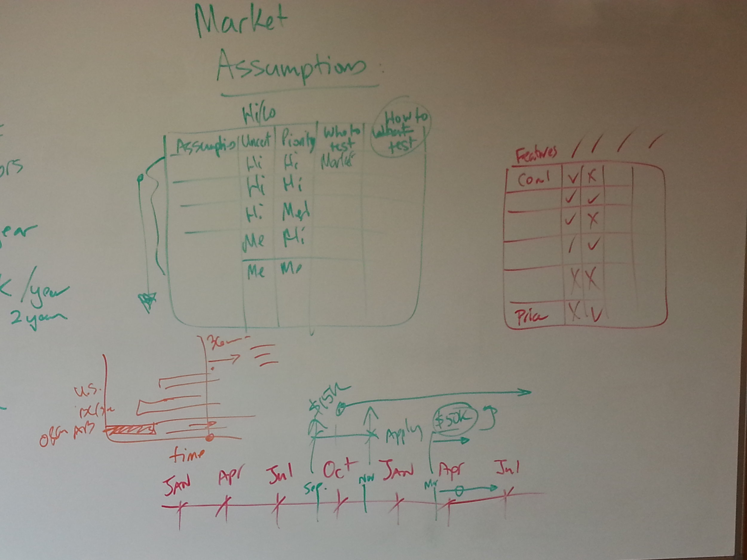
Market Research
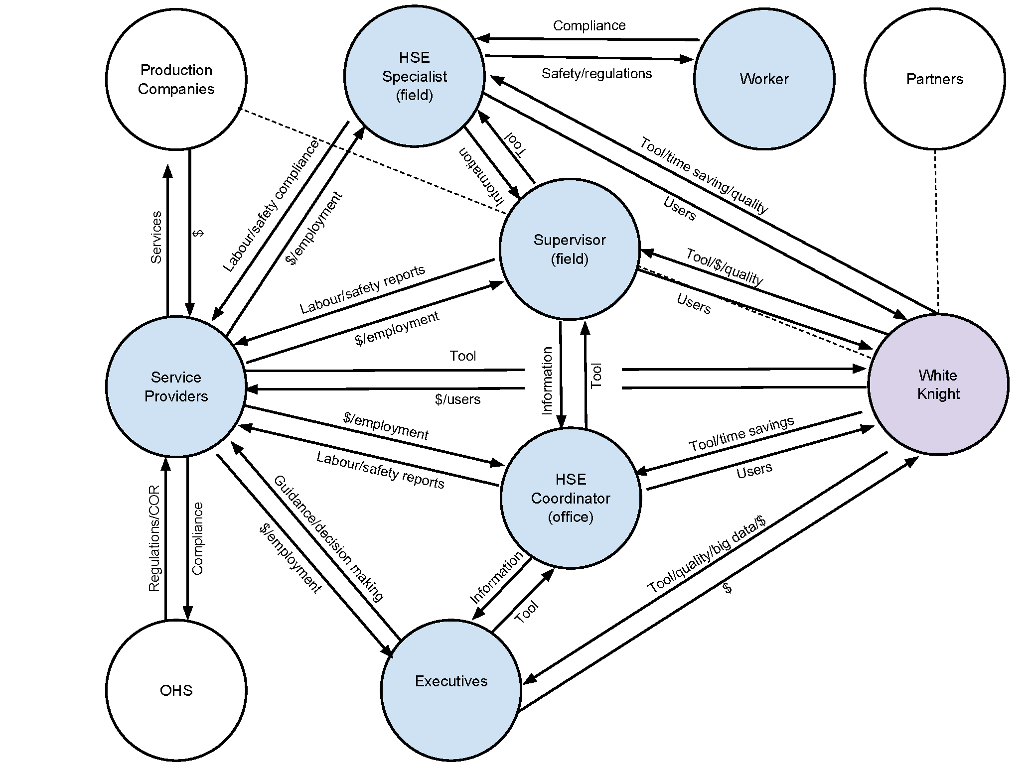
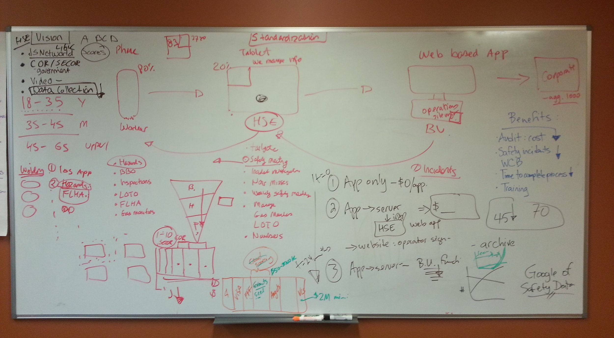
Customer research
Seventeen representatives from 17 companies were contacted to participate in one-I contacted 17 representatives from 17 companies to participate in one-on-one phone interviews. Companies were selected based on the following criteria:
- Based in Alberta, Canada.
- Between 50 and 250 employees.
- COR certified (Certificate of Recognition).
Via interviews and user research with HSE advisors, coordinators, consultants, and managers, I learned how other oil, gas, and construction companies managed their health and safety programs.
All interviewees believed the construction app could be very valuable to the industry. However, several challenges needed to be addressed.
Challenges
- Inadequate Smartphone Access: According to interviewees, most field workers were provided smartphones for company use. However, while they might own a smartphone for personal use, not all workers were willing to use it for work, nor were they likely to have the same type of device. These two factors posed a potential barrier to enterprise-wide adoption.
- Cellphone Restrictions: According to interviewees, workers had to leave their cell phones in the trailer or car unless it was an intrinsically safe device.

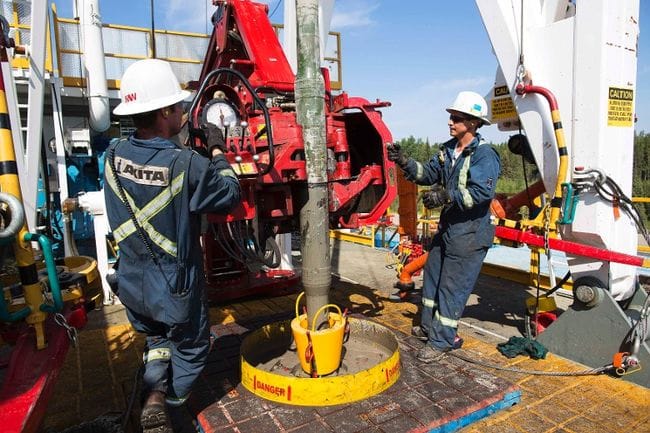
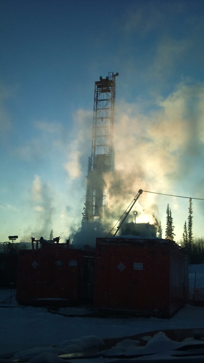

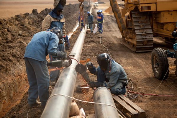
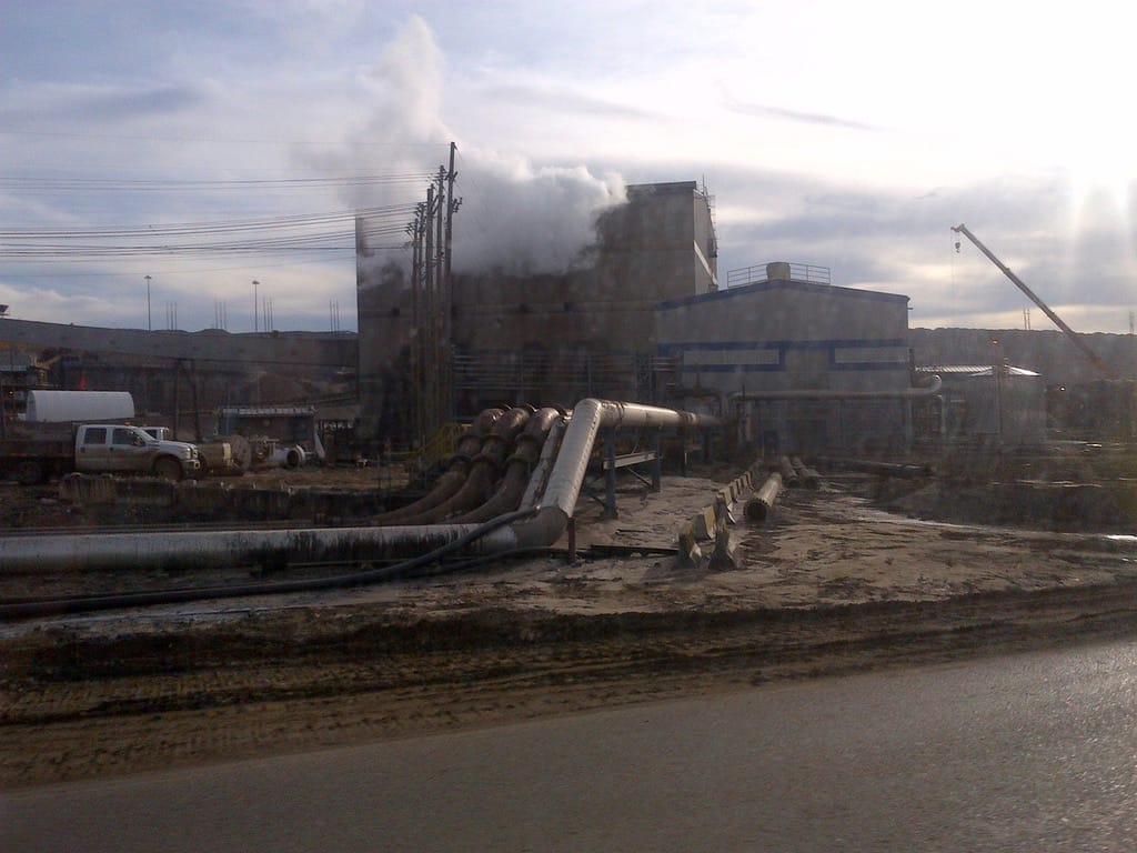
With so many job sites, interviewees weren't sure if workers could complete safety documentation on their phones.
- Field Worker Behavior Change: Related to the above concern, interviewees indicated the solution might require workers to change their behaviors. Today, workers can be onsite, beside the hazard/equipment, with pen and paper, filling out the required documentation. With White Knight’s solution, they would have to complete this work in their trailers/cars, where they could use their smartphones.
- Reliability of Cell/Wi-Fi Reception: According to interviewees, while the app enabled offline use, guaranteeing access to information onsite was critical. Currently, an HSE supervisor receives all paper documentation for review. With our solution, HSE supervisors could face challenges accessing safety data if it was only stored locally on the offline device.

- The iOS App’s Limited Features: Given the number of competitors in this space, and factoring in new entrants, interviewees sought a complete, all-in-one solution and believed our proposed solution lacked inspections, incident reports, audits, safety manuals, MSDS sheets, training, etc.
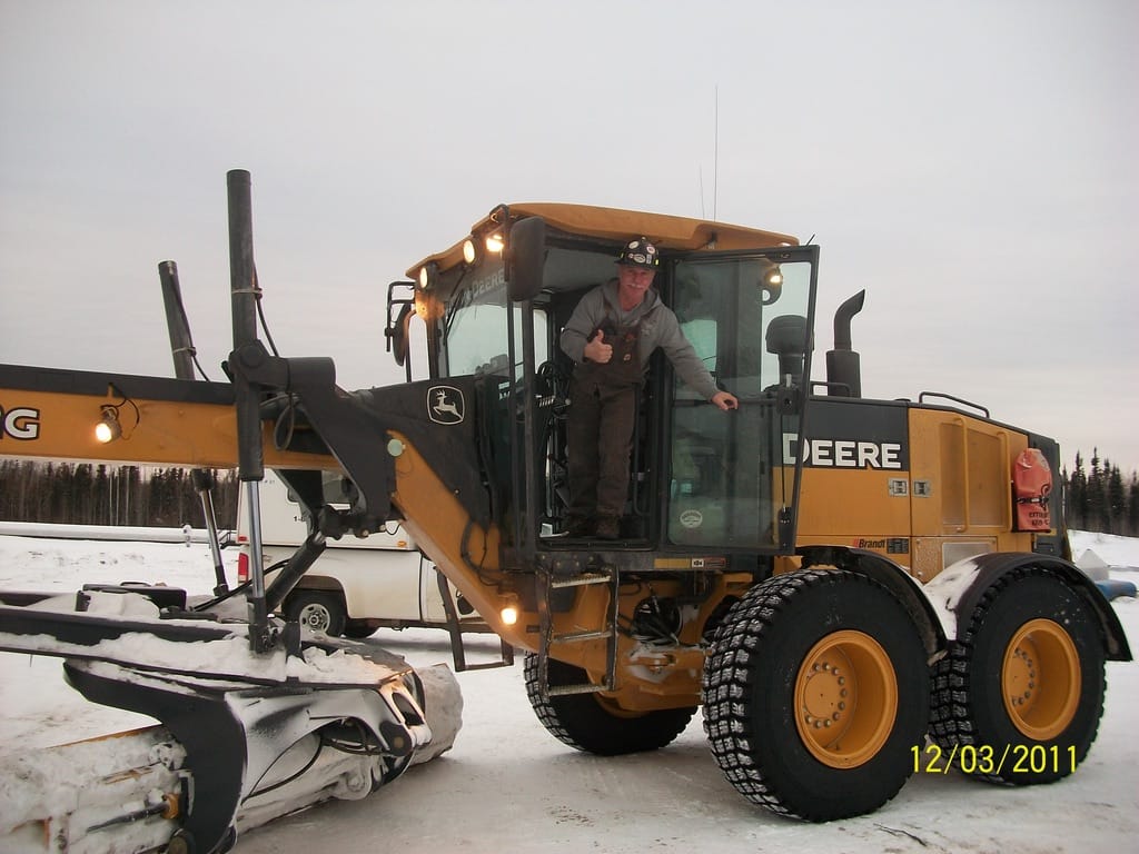
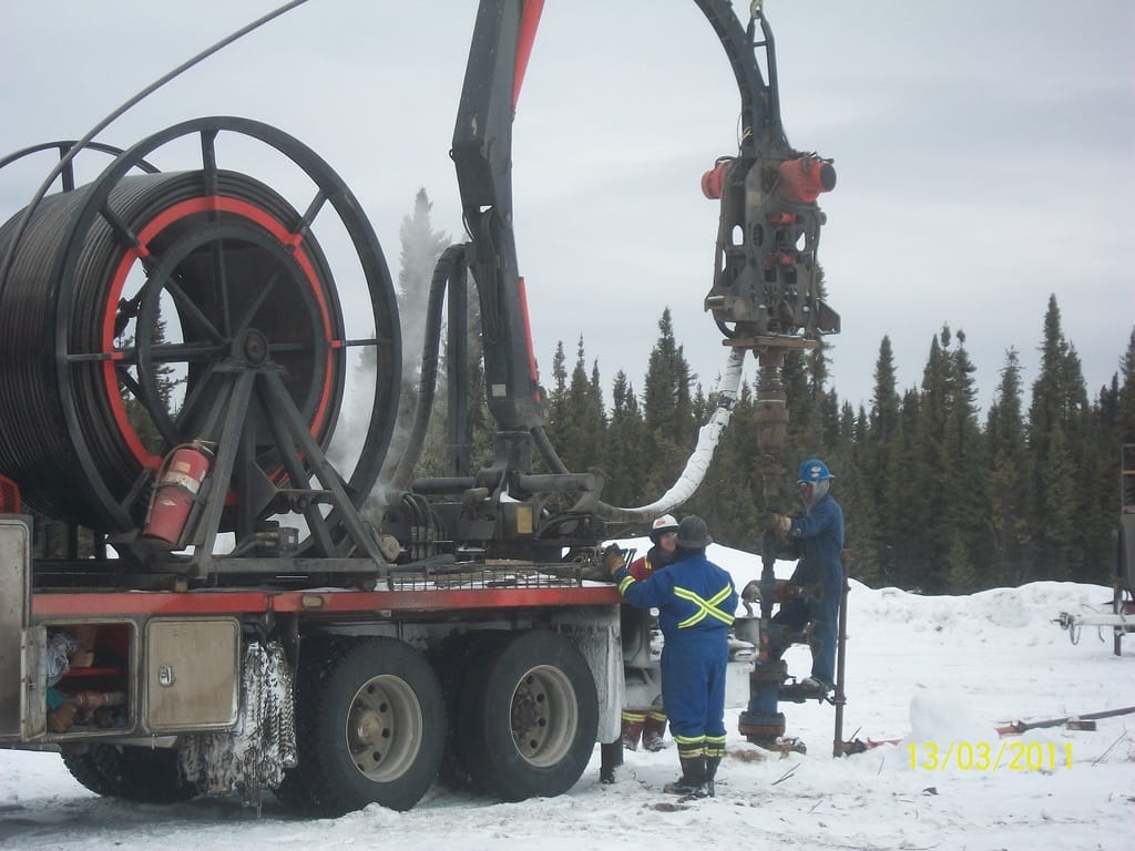
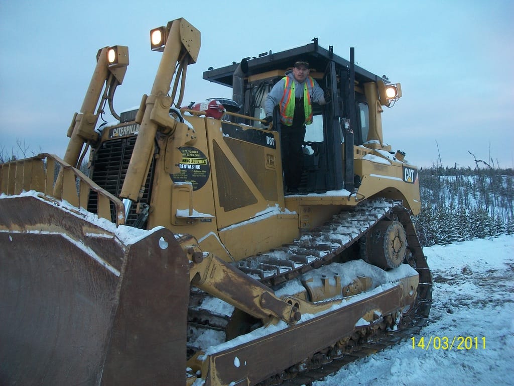
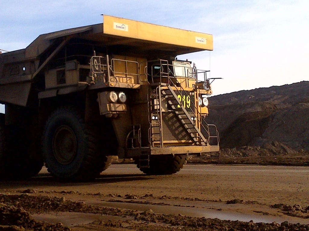
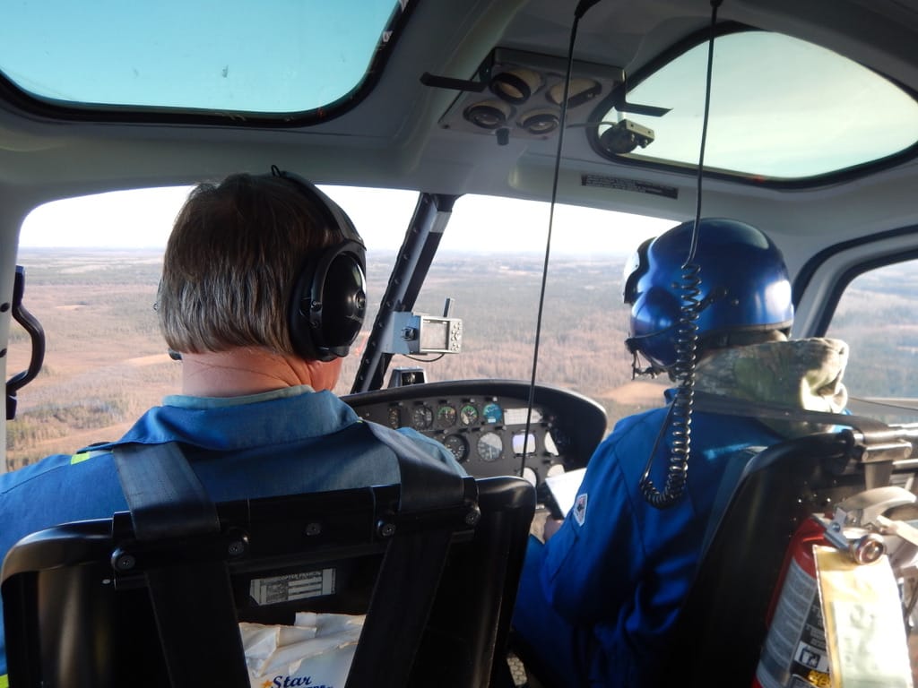
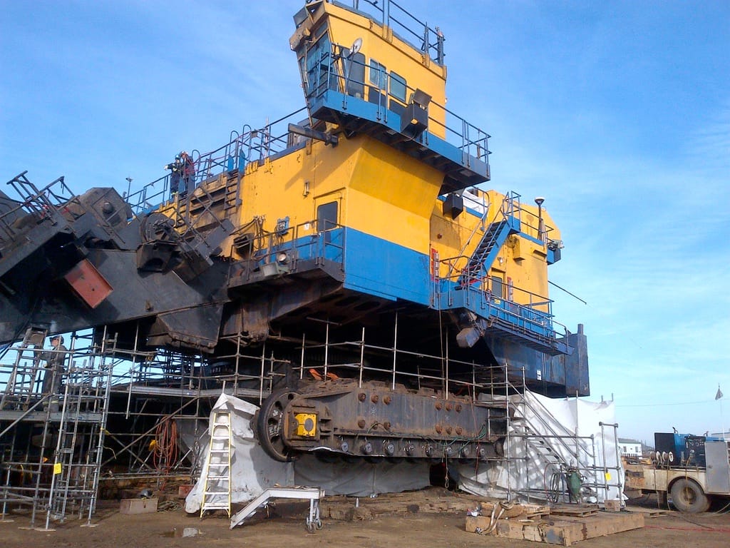
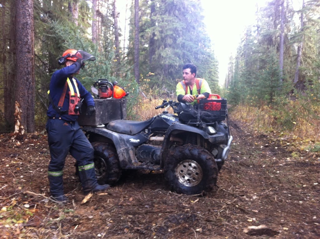
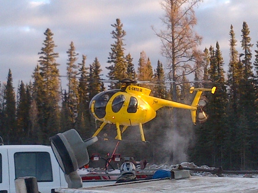
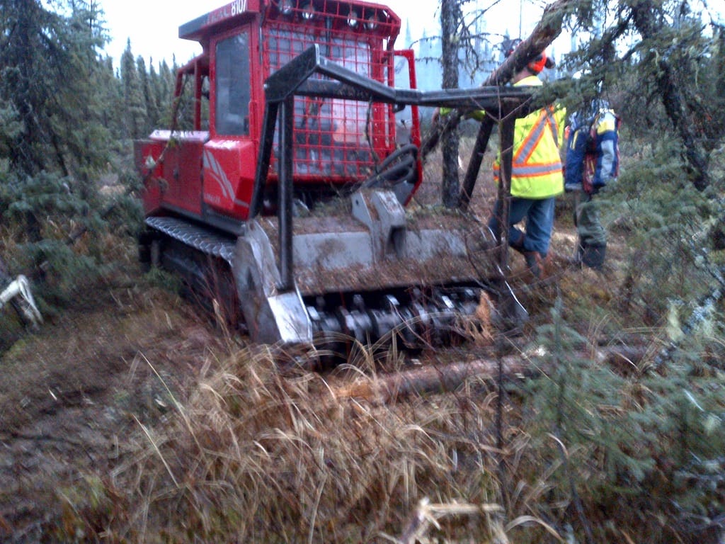
The app needed to meet the needs of many different worker activities using different equipment.
- Standardizing the iOS App’s Compliance Forms: All interviewees believed our proposed solution would face challenges in offering standard forms. While some believed the industry should standardize, others believed the forms were specific to the company, and the work performed made it impossible to standardize.
Personas
At this point, I realized the primary persona would be the field worker, who generated the most documentation and often interacted with the app. However, three other personas were essential to us besides the field worker: 1) the HSE field coordinator, 2) the HSE office manager, and 3) the executive.
Insights:
- Because field workers must complete so much documentation, they focus on speed over quality. If we could speed up the process, we would incentivize the field workers to fill out documentation with higher-quality information.
- For example, if I could wireframe a functionality allowing the field workers to clone a document and edit the content, I could save them hours of work.
Journey mapping
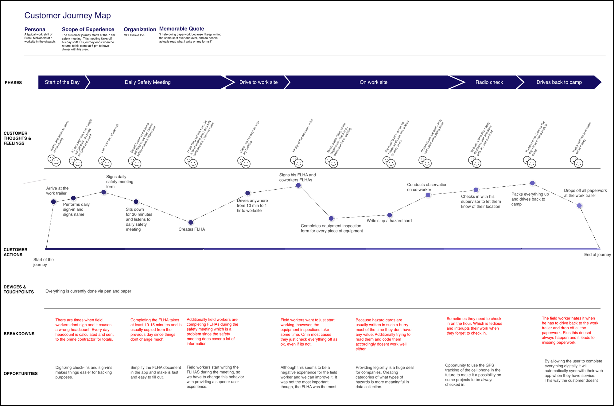
To better document the field worker’s journey, I generated a customer journey map with critical actions, touchpoints, and breakdowns during a day shift working on site.
Insights:
- At the end of a shift, work crews have to drive to their work trailers and physically hand in the documentation to the HSE field supervisor and contractor. If the work crews could skip having to drive to their work trailers and instead upload their completed documents offline, it would save them a trip.
- The FLHA document was completed during the morning safety meeting. This document was intended to be completed when the field worker and his crew arrived at their work site. If the field worker could clone his documentation at the work site, he might write up more pertinent information that the company could use in risk mitigation.
- Hazard cards did not convey helpful information the HSE field coordinator could use and share with other work crews.
Task analysis
Interviews indicated that field workers and HSE field coordinators spend most of their time interacting with HSE compliance documentation. I decided to focus on the field workers’ experience first, since they generated the most documentation.
Insights: A task analysis helped provide insights into how field workers completed documentation (i.e., it was not a solitary act but a team effort that required the involvement of co-workers who reviewed and signed their HSE documentation). This insight led me to focus on what would be the best outcome for the field workers and how we could help them complete the documentation more quickly.
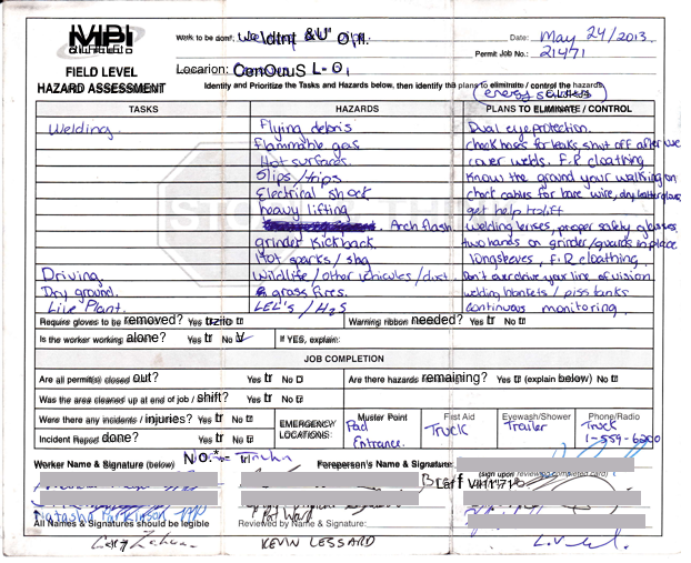
- The field-level hazard assessment (FLHA) document was the most complex to fill out and required the most time. It was a living document that was updated throughout the work shift.
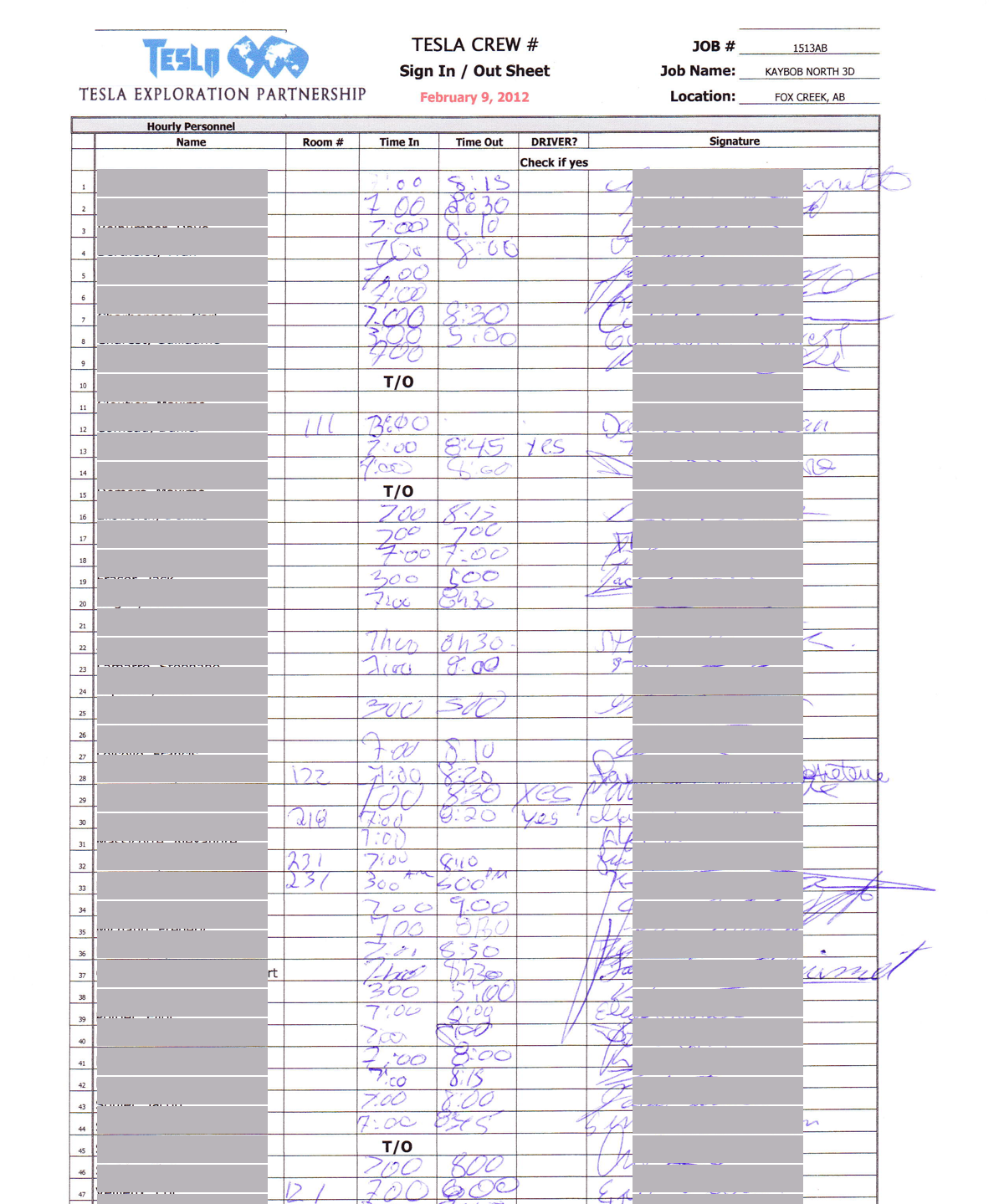
- Almost every document the users interacted with required a signature and sometimes multiple signatures. Some users commented they were not sure how we would solve this.
Proposed capabilities
Based on my research, I developed several core capabilities customers would look for in the construction app:
- The app must store completed forms offline and send the data once connected to a cellular network.
- Ease of use and a great user experience were critical for field workers who used the app. The workers' ages ranged from 18 to 60 years old.
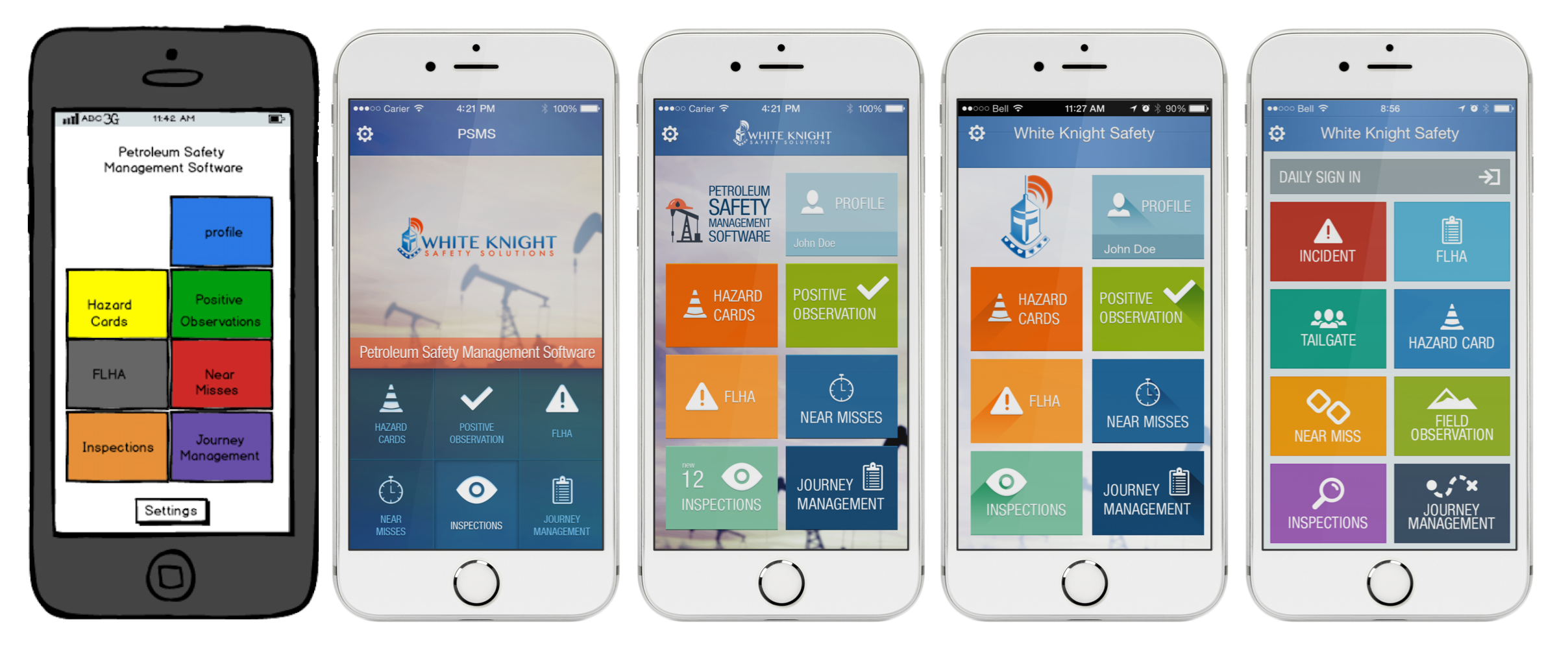
- The app's core functionality would consist of the following features:
- Daily Sign-In
- Near Miss
- Daily Vehicle Inspection Form
- Tailgate
- FLHA
- Incident Form
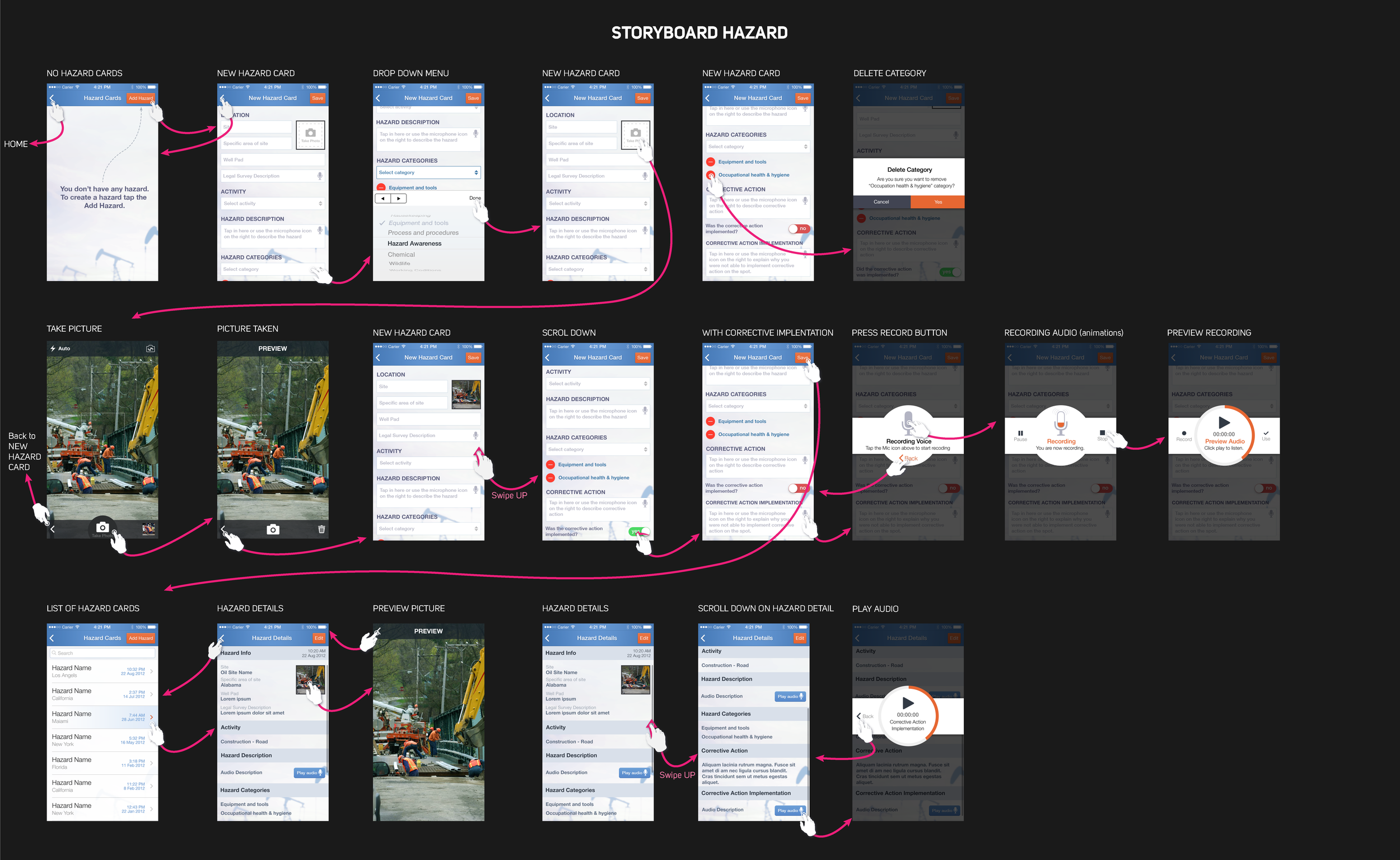
- Hazard Card
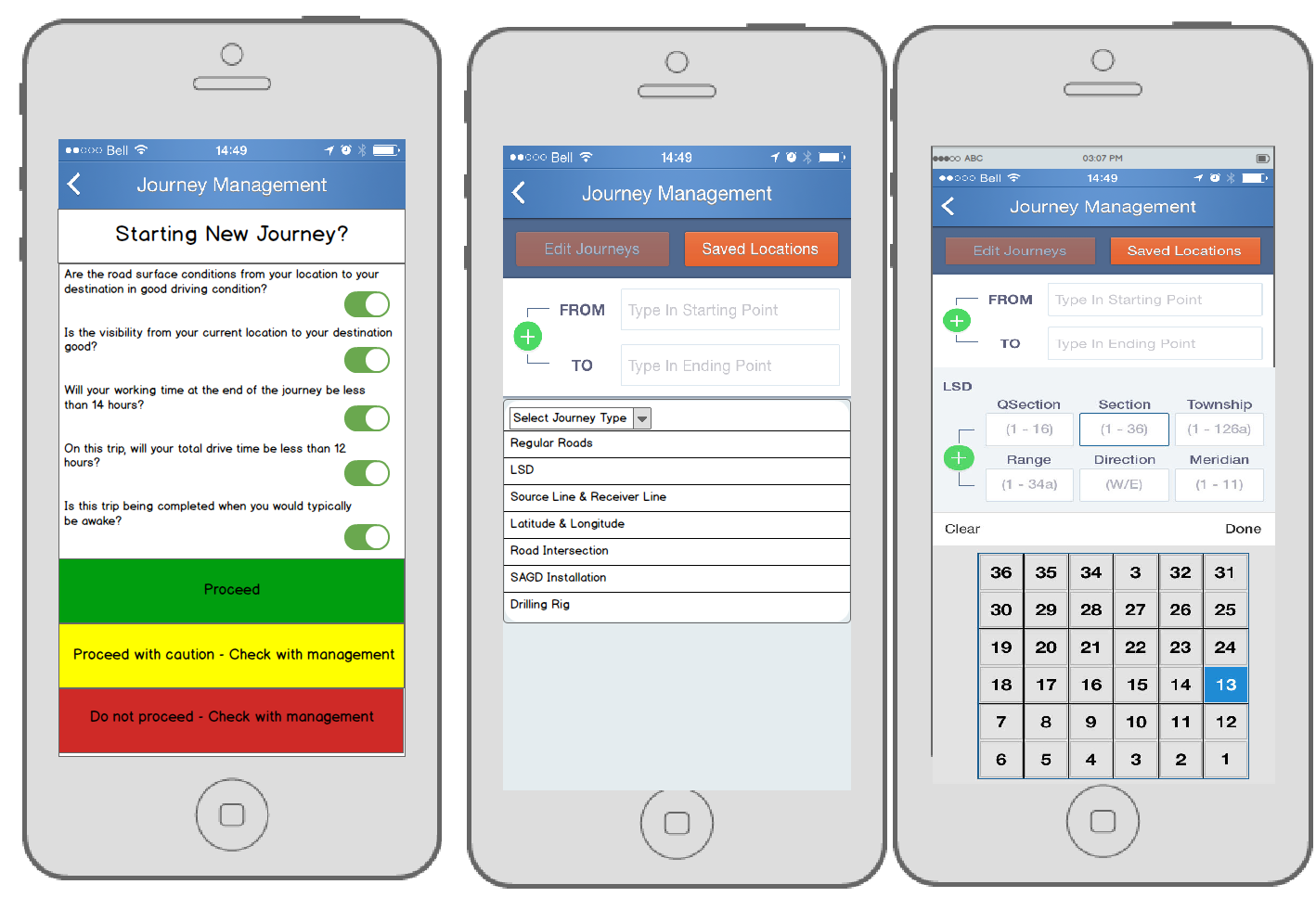
- Journey management and safety manual capabilities would be a lower priority.
- The flexibility versus standardized forms must be determined throughout the development process.
Wireframing
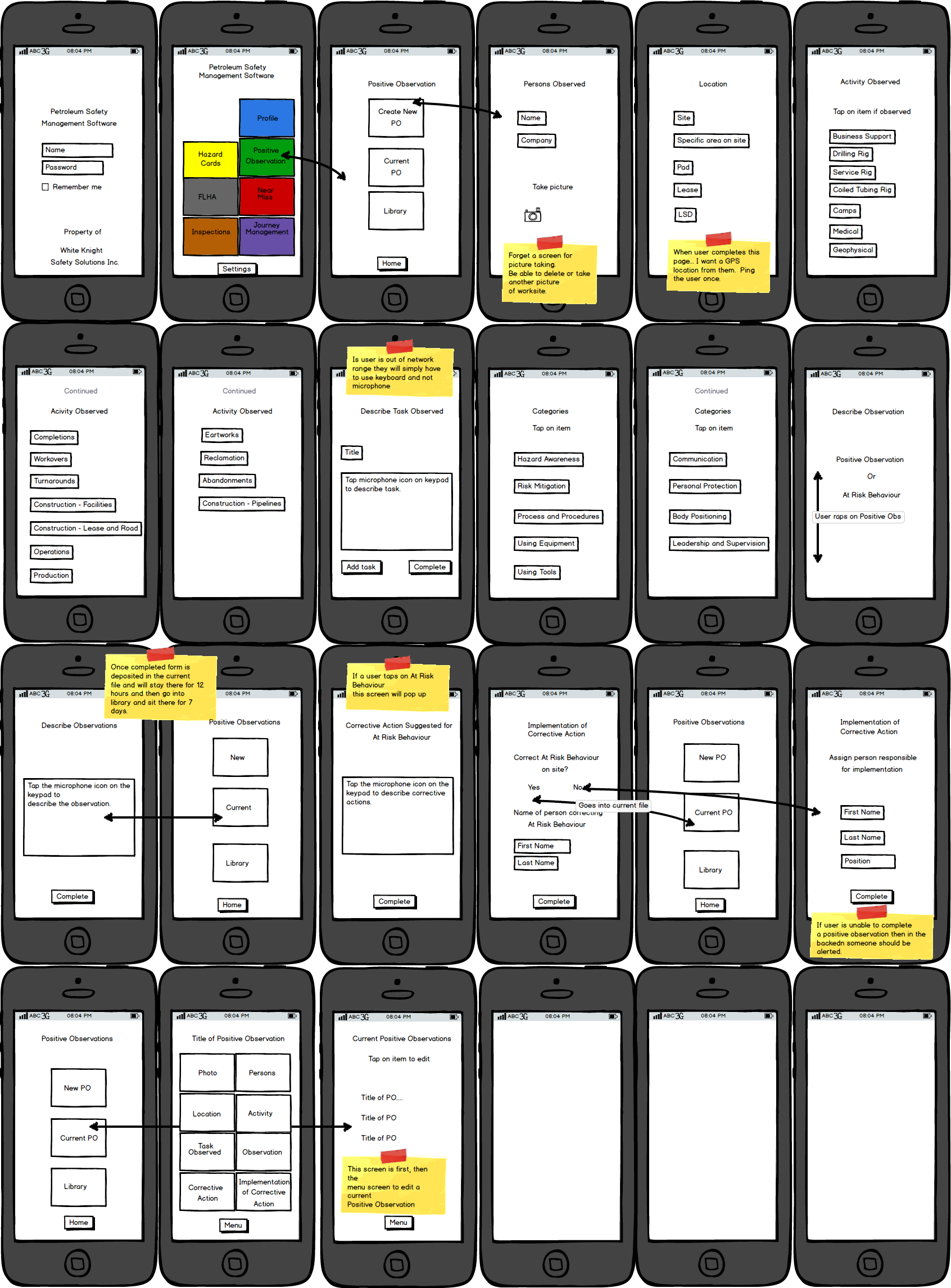
I brainstormed ideas and produced wireframes to fill the gap between the present state and our proposed solution.
Insights:
- I adopted a worker-centric approach to accommodate the field worker’s needs. One of the challenges we encountered was that the age range of our field workers was anywhere from 18 to 70 years old.
- Focusing on simplifying the experience was critical. Otherwise, the complexity of the documents that flow within the app as the user goes from screen to screen would confuse them and stop them from completing their task.
- The last point led me to focus on a hub-and-spoke information architecture. Users, out of habit, would complete one task at a time rather than multiple tasks simultaneously.
Visual design
As I iterated through the main features, I constantly simplified the user experience by focusing on the customer’s cognitive state. We continually looped in their feedback to produce pleasant user flows as they completed their documentation.
Highlight #1 Individual users can sign up
Alignment
- Our competitors at the time forced everyone to sign up via their web browser application because you could not add a user to their mobile app; their apps were sign-in only, and you could not sign up.
- I created a straightforward sign-in and sign-up onboarding flow for the users to start interacting with the app and completing their daily tasks.
User Goals
- “I want to be able to sign up quickly. I don’t want to spend 10 minutes filling out the information in the app.”
- “I want to do all my forms on an app. I don’t want to use an app and carry all my paperwork.”
Business Requirements
- Contractors need to be able to sign up from their devices because companies hire mostly contractors for all their projects.
- Mobile sign-ups were critical because contractors and consultants often drive to the worksite, preventing regular onboarding at the head office.
Highlight #2 Duplicating completed documents
Alignment
- The user could duplicate the previous day's FLHA and change pertinent information.
- I shortened the time it takes to complete this document from 30 to five minutes.
User Goals
- “I hate writing up FLHAs; it takes me 30 minutes every morning. If I can complete this form fast, I only want to use your app.”
- Download actual paperwork from the field here
Business Requirements
- All employees must write this document at the start of each shift.
- They need to be able to sign this document multiple times throughout the day.
Highlight #3 The ability to document a variety of incidents
Alignment
- At first, the app could complete all the essential health and safety documentation.
- Later, we added the capability to add bodily injuries, vehicle accidents, and oil spills. Those forms
User Goals
- “As a health and safety consultant, I must track all incidents on my work site. I need to be able to document all these issues, I can’t document some on paper and others in the app; I need to be sure the app can document everything.”
Business Requirements
- By law, we must document and report all worksite incidents.
- Management must be able to view and acknowledge reports via managers' signatures to show the government they are taking action to mitigate these risks.
Reflections and details
- Start with small user tasks and seek feedback much earlier instead of waiting until it’s too late.
- Identify only the most critical tasks to the customer. Focus on those, and perfect that user experience.
- Have a vision of what you want your product to be but exercise strategic patience while you explore the path to revenue.
- The opportunity is found in talking with the customers, continuing to do so, and minimizing the distance between you and them.
Type: Native iOS App, PHP web application (LAMP stack)
Date: May 2013 - February 2016 (2 years 9 Months)
Company: White Knight Safety Solutions, Inc.
Role: Founder/Product Management/Design
What I Did: Marketing, sales, 0-1 product development, product development, product management, product strategy, app development, onboarding, SaaS, B2B, email marketing, sales demos, customer interviews, user research, JTBD Framework, personas, journey map, information architecture, wireframing, prototyping, and visual design.
Get in touch
Thank you for visiting my case study. Please contact me if you want to discuss any of my case studies and see an opportunity to work together.
I'm Leo, the writer behind The Triangle Offense blog. Diving deep into UX, CX, and customer-centric business strategy, I provide insights into using timeless CX and UX techniques to attract and retain customers to unlock business growth. Join me on this journey, and let's reshape how to grow a business together.