How I designed the Lowe’s eProcurement B2B shopping list
Case Study | Leo Vroegindewey | 2019-2020

Highlights
- I designed a shopping list feature for lowesforpros.com and Lowe’s internal eProcurement, mentoring a junior product designer throughout the paired design effort.
- This capability targeted an additional US$8M to US$25M dollars of annual revenue for the Lowe’s eProcurement business team.
- My solution reduced the time to purchase products from two hours to under 10 minutes.
- Lowe’s eProcurement customers can now easily manage 50-100 product SKUs in one shopping list.
"You guys hit the nail on the head with this shopping list."
Bethesda Health Group

Introduction
The business team that managed Lowe’s eProcurement requested my product design team to devise a shopping list for Lowe’s internal eProcurement website. As the senior product designer, I designed the end-to-end B2B shopping list.
I had been at Lowe’s for two months, and my partner product designer had started only one month prior. We were constrained by a deprecated UI design library called Scaffold, and with little customer knowledge, we began planning the project’s execution.
Our primary challenge was a non-existent wireframe library to help us build our wireframes. We faced many other minor challenges (such as unavailable UI guidelines) because no design team had touched the ePRO platform in a long time.
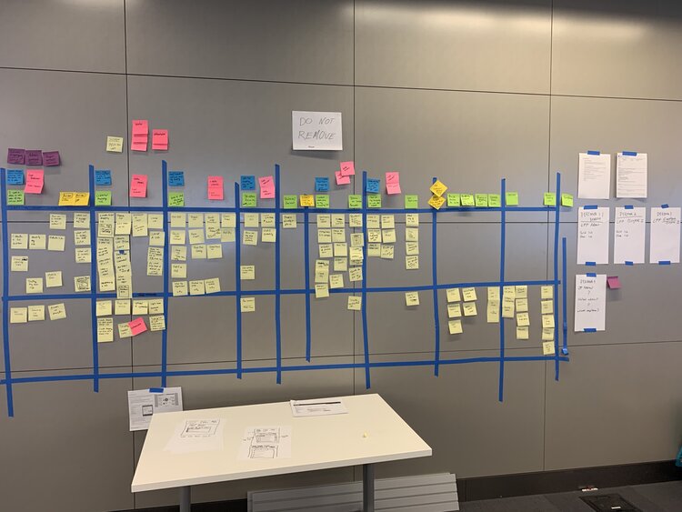
I overcame the lack of customer knowledge by running a user story mapping workshop, in which I pooled the current information by inviting all relevant stakeholders to share their knowledge and experience.
This design project was different because I worked in tandem with a junior product designer, and we ran a paired design model for this project. After overcoming some growing pains, we accelerated and completed the project on time and with glowing customer praise.
Intake and discovery
The design team didn’t conduct user research or utilize any previously-created user research that would have highlighted pain points and potential opportunities to improve the customer experience. However, we leveraged our business partners’ knowledge to get a baseline understanding of the eProcurement customers and which of their paint points a shopping list would solve.
Insights:
- My product designer and I knew little about ePRO and its customers, so I decided to facilitate a user story mapping exercise to uncover all the steps a customer would need to complete when using a shopping list.

User story mapping workshop
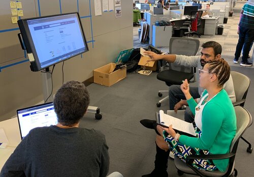
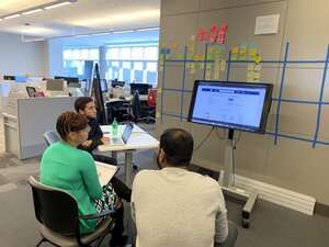
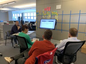
I led the user story mapping workshop with two product managers from the eProcurement product track, the business stakeholders, the tech lead, and three product designers, most of whom had never participated in a user story mapping workshop. Together, we identified all the major tasks and prioritized the work for slice #1.
Insight:
- Leading this workshop required me to provide context for why we were doing things a certain way and explain how the workshop would achieve our goal of building a shopping list that aligned with the user and business goals.
- The user story mapping workshop created credibility and trust among our partners when they realized we could help them. However, before that happened, they had to get uncomfortable by stretching their limits.
- This workshop led to total participant alignment before the first screen was designed, which helped us throughout the entire effort and provided a design framework.
Breaking down the feature from a user perspective
The great thing about a user story mapping exercise is that it allows all stakeholders to participate and provide their input. During this workshop, we focused on all the details the shopping list would need, as the customer would create, use, and ultimately purchase products from it. The workshop initially took two hours and later required additional refinements.
Insights:
- The design work centered on several important concepts. For instance, we needed to house the new shopping list function in an area that was easily accessible on the ePRO website.
- Secondly, list creation and in-list management would be the shopping list’s most-used tasks.
- Lastly, building a scalable MVP was critical. We had to build a lightweight version immediately, but we understood that more functionality would be built into the shopping list later.
Paired design team
We worked in five-day sprints. At the end of each sprint, we would demo the product. We presented designs in Invision, used high fidelity, or built them using GIFs. For key UI moments, we used ProtoPie to provide detailed demos.
Insights:
- The business team had never worked in five-day sprints, but they grew to love them because they could see and comment on the work as it progressed from week to week.
- Working with another product designer on this project had challenges, but it provided more upside, and it got better as the project progressed.


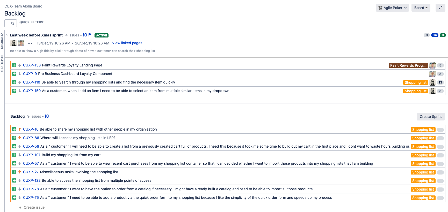
Managing the work in Jira
Following the user-story mapping workshop, I reviewed the wall of sticky notes, adding missing sub-tasks and looking for gaps in the user tasks written the previous day. Once most tasks and sub-tasks were accounted for, reviewed, and refined during the week, I could start digitizing the workshop content into Jira.
Insights:
- Jira is far from a perfect tool. However, it was great because it gave our product manager peers 100 percent visibility into our progress.
- The value of using Jira is far beyond that of a designer. From an organizational level, it showed our team’s value, and as we accomplished work, it built credibility with our partners.
- We were self-managed, which drove ownership and accountability. This was a great takeaway for my partner product designer.

User flow diagrams
Working through responsive designs helped us iterate the user flow that would propel the customer through the shopping list. A user flow doesn’t only link pages to form a completed task chain. We did a deep dive into each task’s smaller tasks to ensure that they were easy to access and complete.
Insights:
- Whether customers are on computers in their offices or on the go using their mobile devices, creating a list, managing it, and ultimately purchasing products needs to be incredibly simple.
- Focusing on the smallest screen and the shopping list’s detailed functionality helped us formulate an excellent user flow for all the feature’s different tasks.


Sketching
I used a variety of tools to sketch the wireframes and designs:
- Pen and paper
- iPad Pro and pencil completed the task chain. I used the Notability app to sketch all the wireframes and user flows.
- I tested the Concept app to help with my design process.
Insights:
- Early concepts that worked perfectly in my mind didn’t always pass the test once I saw them on a screen; sketching helps me quickly iterate through key UI moments that are detail-heavy.
- For example, we thought we could create a two-column layout on a shopping list page and have a left-hand menu present at all times. After sketching it out, however, we found it didn’t meet our goal to make the shopping list the webpage’s focal point.
- Working from the outside on the shopping list while framing smaller components and elements helped me get through the “what if” stage, which got me wireframing sooner with a good idea of how to structure the pages and internal containers.


Sketching sped up my workflow.
Wireframing
Because my partner product designer and I spent time building a wireframe library in Sketch, the wireframing progressed relatively smoothly. I worked through the main tasks’ user flow and sketched out quite a few of the containers and internal elements within those containers. Wireframing progressed quickly once we sketched out the IA, container, and smaller components.
Insights:
- When wireframing, I wanted to have a 1:1 spec, so I wouldn’t constantly have to reinvent the wheel when we skinned the wireframes. It took some time to figure out the finer details of the Scaffold UI library.
- The shopping list menu was the most difficult to solve during the wireframing phase. The user had to be able to complete specific tasks, so we had to create a menu that could handle the shopping list’s current and future tasks.
- Through wireframing, we realized that we wanted to create the experience of tracking item quantity in the first release. However, technical constraints didn’t allow us to include that functionality. Wireframing was great for uncovering IA and missing functionality that might not have been captured during the user-story mapping workshop.
Visual design
My partner product designer and I split the visual design workload, which entailed applying the Scaffold UI library for the eProcurement platform. This design library had little to no documentation and had been deprecated by most other products. Therefore, we had to find more up-to-date design patterns that had been applied.
Insights:
- We created multiple new design patterns during the shopping list menu design process.
- The eProcurement platform utilized the internal Scaffold UI library, and we found a lot of unnecessary bold typeface that could potentially overload the user. In our visual designs, we strove to keep the number of fonts to a minimum.


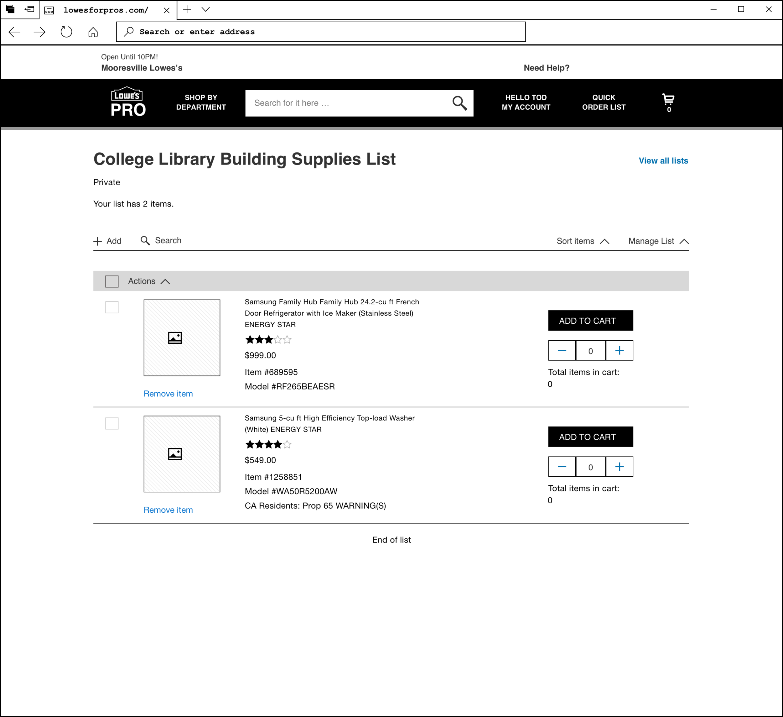
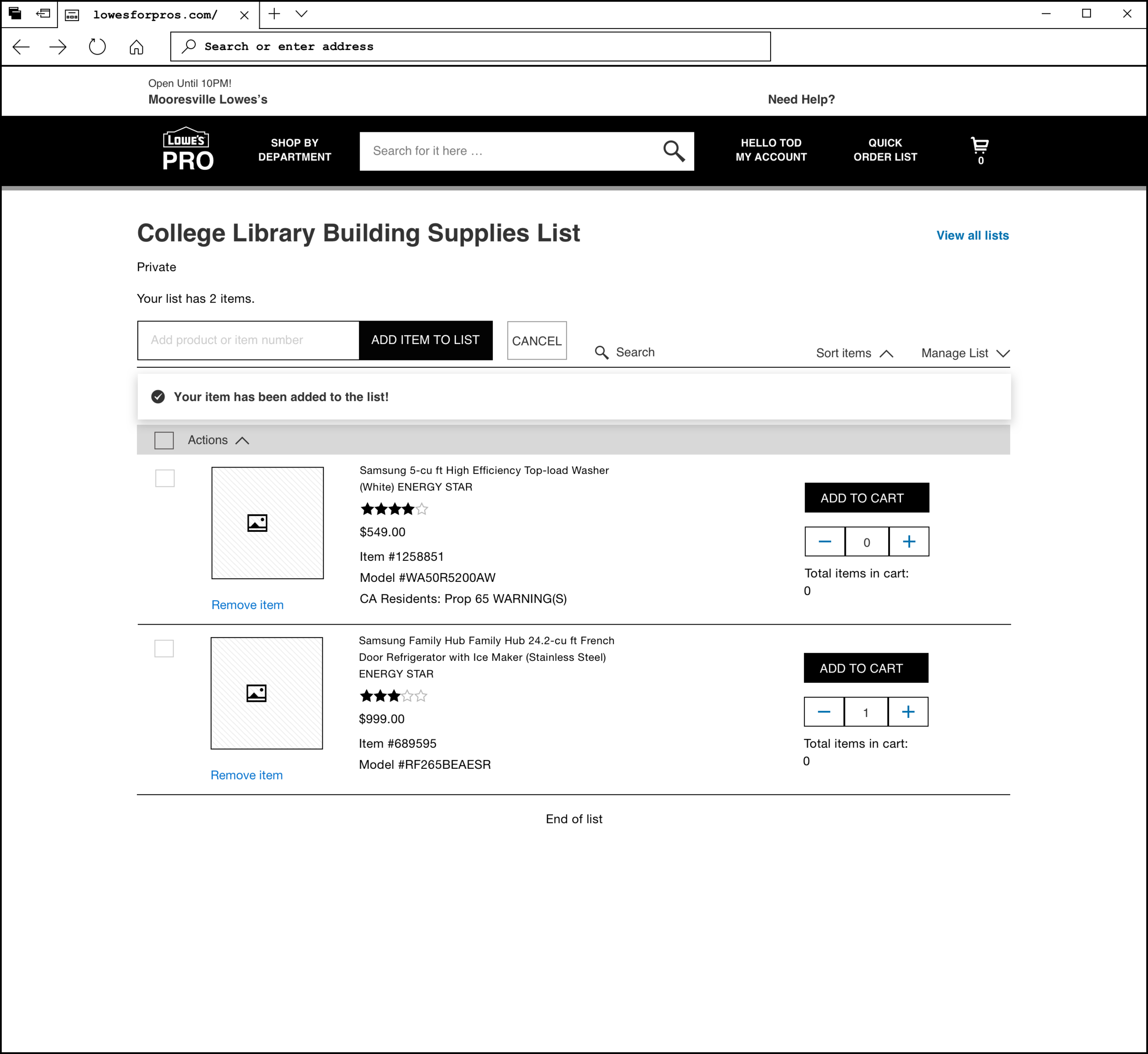
Prototyping key UI moments
Initially, we used Invision to prototype our wireframes and visual designs. However, simple prototyping could communicate the designs’ intent only 80 percent of the time. In our designs, key user interface (UI) moments required more detailed interactive prototyping.
For example, the shopping list menu had several interactive functions that the user could use to manage the shopping list (using the add + button, the search list button, etc.).
I lost the ProtoPie demos, so all I can show is a simple Gifmock demo.
Insights:
- Using a tool like ProtoPie was very beneficial for complicated user interactions, as it highlighted complex and nuanced interactions within the shopping list.
- My partner product designer built out key UI moments every sprint, allowing me to focus on other tasks. When properly organized, the division of labor allowed us to design at a quick tempo.
Stakeholder demos
Every Thursday, we met with our business stakeholders and walked them through the tasks we designed for that sprint. The objective was to create a demo that drove alignment between the user and business goals. The demo had to detail how a user could complete that task within the shopping list feature.
Insights:
- As a design pair, if we maintained a disciplined approach to soliciting early feedback throughout the sprint, we achieved alignment faster.
- We stayed true to the Scrum methodology of working on sprints without knowing every detail. In some moments during our design sprint, we realized we had missed a little point, which forced us to always stay on our toes and focus on the details.
- Invision was able to carry about 80 percent of our workload and show the stakeholders the design’s intent to convey alignment. However, the remaining 20 percent comprised key UI moments that required a more powerful tool such as ProtoPie.
The perfect demo is a clickable prototype.
Feedback sessions with customers
I asked the business team to bring in customers to give us feedback on the design concept before the development team started coding. They found a team from the Bethesda Health Group, who joined us for a meeting, during which we showed the customers our designs and gathered feedback.
Feedback:
- “You guys hit the nail on the head with this shopping list.”
- “This looks pretty straightforward and self-explanatory.”
- “This will save us money in the long run as an organization and speed up our work.”
- “Instead of spending an hour and forty-five minutes building a cart of 150 items, it will all be stored in the shopping list, and I should be able to buy everything I need within five minutes.”
Insights:
- The customer loved the designs and the user experience.
- The customer provided us with great feedback. For example, we hadn’t identified the need for a user to be able to select all the items in a shopping list and add them to their shopping cart. We didn’t have this functionality in the design; however, because the shopping list menu was already primed to be scaled, adding this functionality wasn’t a problem, especially when ordering 150 items at once.
- Sorting the list was table stakes; however, it became complicated around the issue of availability. The solution had to be able to sort through items in a shopping list that were readily available versus those with a wait time. Customers in a hurry would be likely to procure the item from a competitor if they didn’t know how long availability would be delayed.
- Another observation was around the number of items added to the shopping cart from the shopping list and whether the user could save an item quantity as a default setting. This feedback focused on adding to the cart from the list and determining how easy it would be for customers to complete this task.

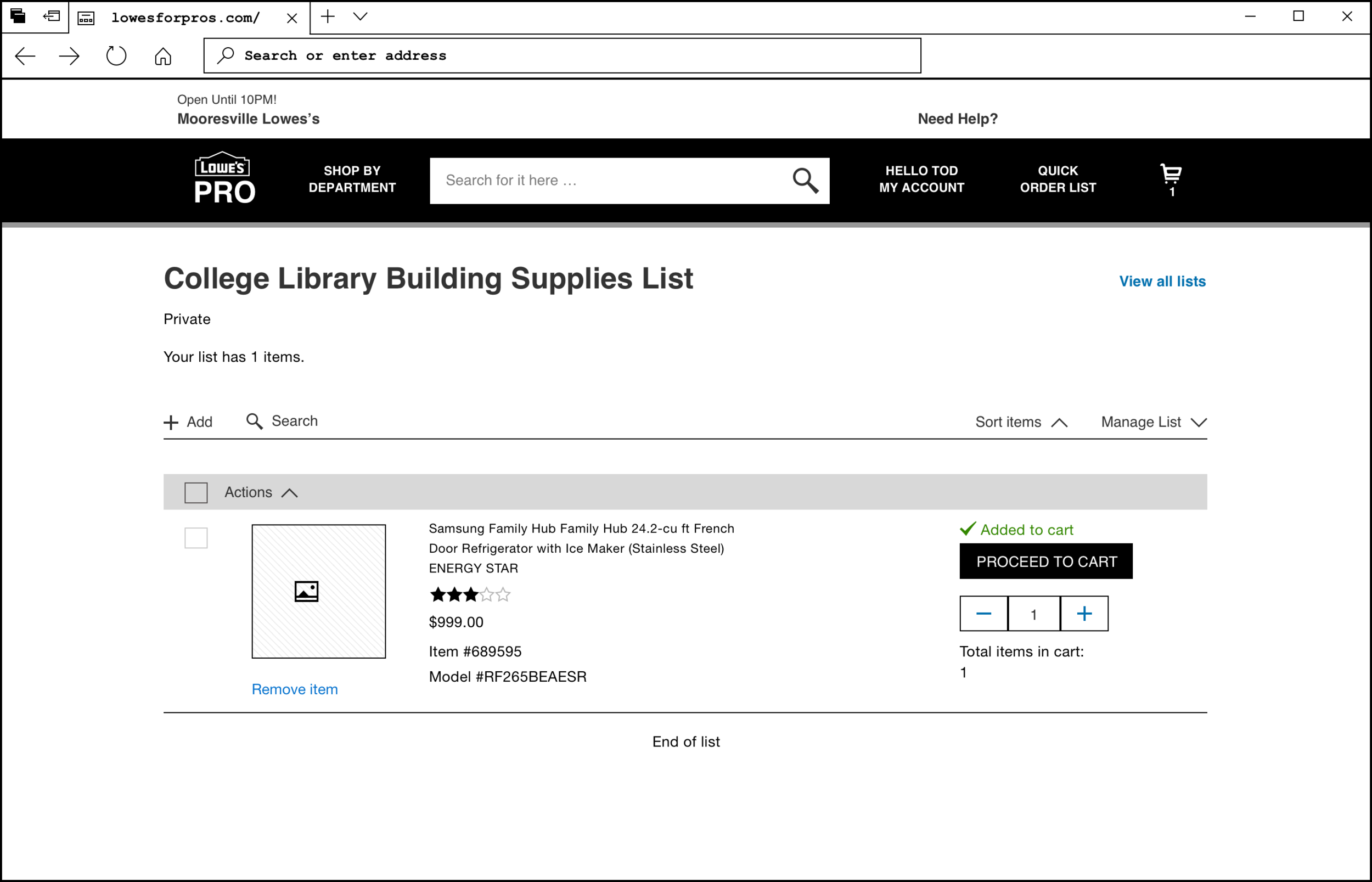
Highlight #1 Shopping list menu
Alignment
- An eProcurement B2B shopping list makes it easy for a user to purchase products repeatedly and in bulk.
- All user flows are accounted for in the various menu tasks a user has to complete.
User Goals
- “We need a shopping list because everyone else has one, and I don’t want to use your purchase portal because it takes too long to purchase products.”
- “I am here to purchase, not search for products on the Lowe’s portal.”
- “Sort and search within the shopping list.”
Business Requirements
- We need a reliable shopping list feature built for the Lowe’s procurement portal.
- We need a shopping list because our customers demand it—it’s a table-stakes feature.
- The shopping list must be scalable and include future functionality that we could not include in slice #1.
Highlight #2 Add a SKU to the shopping list via item number
Alignment
- Users can add an item via item number to their shopping list.
- Item numbers are not deleted or immediately reset but kept in the “add” field. The user can retype one digit of the item number and not lose the entire number.
- Item results can handle multiple outcomes because sometimes an item number equals more than one result.
User Goals
- “I know the item numbers of all the items I order every month; I want to be able to use those item numbers to add items to my list quickly.”
- “Adding via item number should be easy. For example, don’t make me retype the entire number when I know one digit might be wrong.”
Business Requirements
- The customer needs to be able to add an item to the shopping list with an item number.
- The website currently has a catalog customers can use. Still, we want to remove the functionality and move the customer to the shopping list, ensuring it matches or exceeds that functionality.
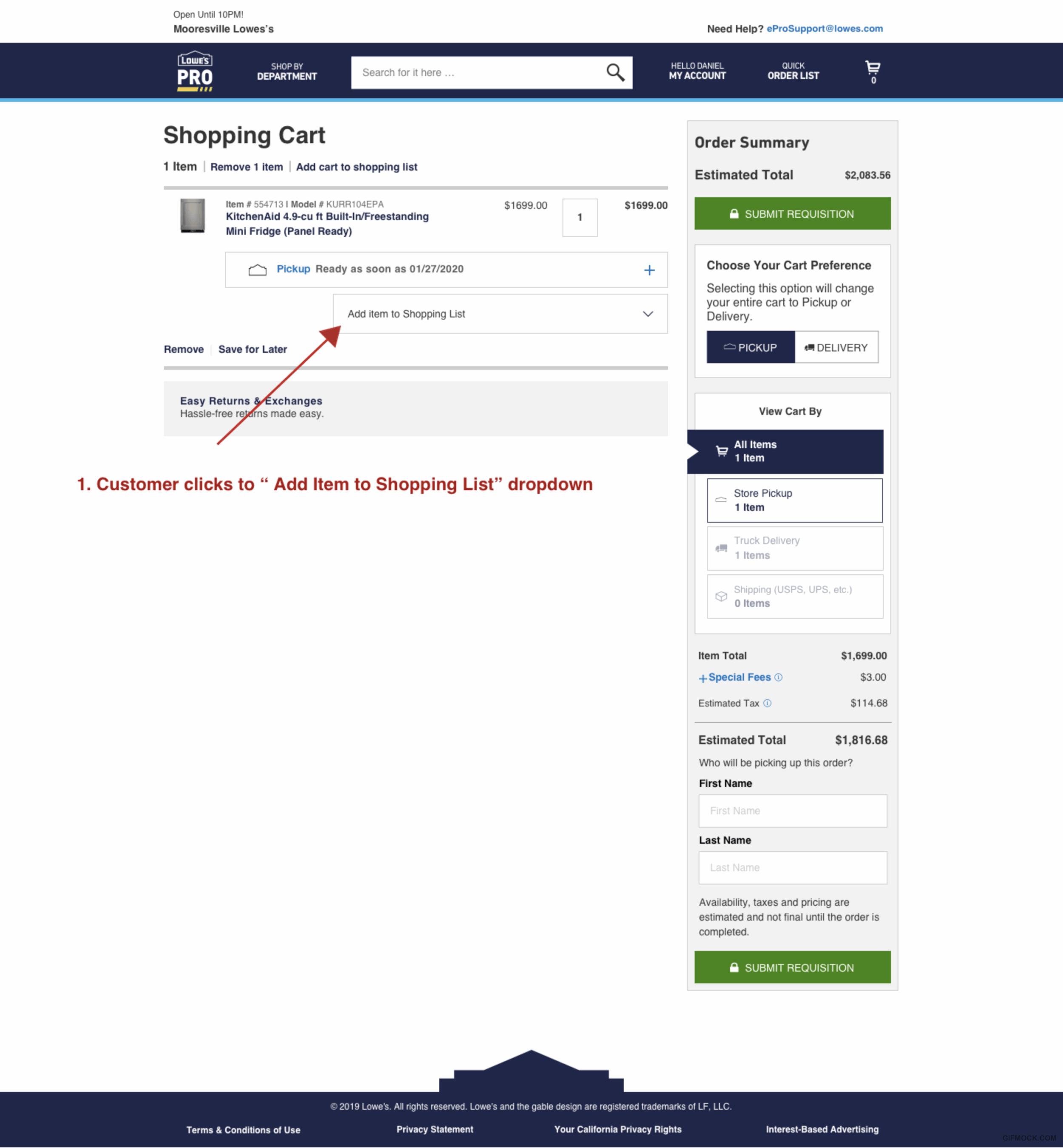
Highlight #3 Add items to the shopping cart
Alignment
- The user can easily add an item from their shopping list to the shopping cart.
User Goals
- “I need to add items by product numbers/SKUs to my shopping list.”
- “Add an item from a product detail page to my shopping list.”
- “Add product quantities.”
Business Requirements
- Customers must be able to purchase items from a list they created based on their most-purchased items.
- Customers must be able to make repeat purchases of their heavily-used items quickly.
- Future functionality: Remember the quantity from previous orders so the customer doesn’t have to enter the quantity again.
Highlight #4 Share list with org, group, member
Alignment
- Users can share their shopping list with their entire organization.
- We designed this flow in such a way that we can accommodate group or member sharing in the future.
User Goals
- “I need to be able to share my list with other members of my organization.”
- “I only want to share my list with a specific group in my organization.”
Business Requirements
- Our customers must be able to share a shopping list with all their organization members.
- Only organization members with permissions can edit the shopping list on the eProcurement platform.
- Future functionality: Share shopping lists with groups and members within an organization on the eProcurement platform.
Reflections and details
- The business stakeholders and product managers were new to working with product designers, which meant that at times I had to go extra slowly and explain why we do the things we do. When you’re the expert, you don't change your process. You have to explain to others what outcomes the process will produce.
- After we completed this project, the business stakeholders were ecstatic with how their new shopping list turned out. They loved seeing the work every week and were impressed with how fast we designed this shopping list capability.
- This product enhancement was built utilizing a design pair model. Initially, the design pair model was challenging to execute; it took several months to gel.
- Can you tell I love to sketch? Drawing helps me think. This project was no different for me. I loved the Notability app because it was easy and straightforward.
- We had to use a deprecated UI library called Scaffold, and it was awful. It's outdated—had been untouched for years. Therefore, we had to do a lot of cleanup along the way, which slowed us down because we sometimes had to create new components from scratch. Still, we got it done.
- I mentored a new hire and product designer throughout this design project. Working closely with another designer was fun; however, it did impact the speed of our designs at times.
- I had to pick which areas needed a deep dive and ignore others.
- We asked customers to join our demos to gather feedback throughout the process. However, business stakeholders were uncomfortable with that approach. They didn’t feel comfortable enough to include their customers in our demos until very close to the end of the project.
- This was the first time I used user story mapping. It helped me make sense of the requirements and quickly cut a path through the chaos.
- I ran a very heavy design sprint schedule, putting a lot of pressure on myself. I had a lot of other things on my plate during this project. It worked out, but in hindsight, I could have padded the project with an extra sprint.
- Pairing Sketch with Invision proved to be a winning combination. ProtoPie picked up the key moments where static design couldn’t display the complexities required.
- I never cared for Abstract and found it a clunky tool. It reminded me too much of GitHub. The concept is sound, but using the tool was cumbersome.
Type: Responsive web design
Duration: October 2019 - January 2020
Product: Lowe's eProcurement
Feature: B2B Shopping list
Company: Lowe’s
Role: Senior Product Designer
Official Website: lowesforpros.com/epro (Internal site for Lowe’s customers)
What I Did: User flow diagramming, sketching, wireframing, user story mapping, mentoring a designer, writing user stories, interactive design, information architecture, site maps, responsive web design, UX design, product design, agile, design sprints, usability testing, and prototyping.
Team: Lowe's Core UX design team
Team members: Senior product designer and a product designer.
Tools: Abstract, Invision, Jira, ProtoPie, Concepts, Sketch, Overflow and, Notability.
Workshops: User story mapping.
Get in touch
Thank you for visiting my case study. Please contact me if you want to discuss any of my case studies and see an opportunity to work together.
I'm Leo, the writer behind The Triangle Offense blog. Diving deep into UX, CX, and customer-centric business strategy, I provide insights into using timeless CX and UX techniques to attract and retain customers to unlock business growth. Join me on this journey, and let's reshape how to grow a business together.