Leading Target State Design at Scale: How I Modernized Lowe's $250M Flooring Installation Experience in 6 Weeks
Case Study | Leo Vroegindewey | 2022
Highlights
- I led, managed, and delivered a target state affecting how 1M sales quotes are managed and impacting the US$250M flooring installation service segment.
- Navigating complex legacy tools and a matrixed organization, I created a target state of the modernized Lowe's flooring installation customer experience in six weeks.
- I successfully streamlined the quote-to-sale process, cutting the turnaround time in half.
- I reduced the legacy software tools used throughout the quote-to-sales process, cut operational costs, and condensed Lowe's associate training.
- I spearheaded the modernization of Lowe's most complex installation service, setting a precedent for the comprehensive modernization of Lowe’s Services line of business (LOB).
- I generated over 30 use cases across the Lowe's technology organization from this target state project.
"Leo's superpower is assembling a backlog of discovery insights and prioritizing those in a way that corresponds to business priorities and is transparent to all stakeholders."
Lori Landesman – VP of User Experience
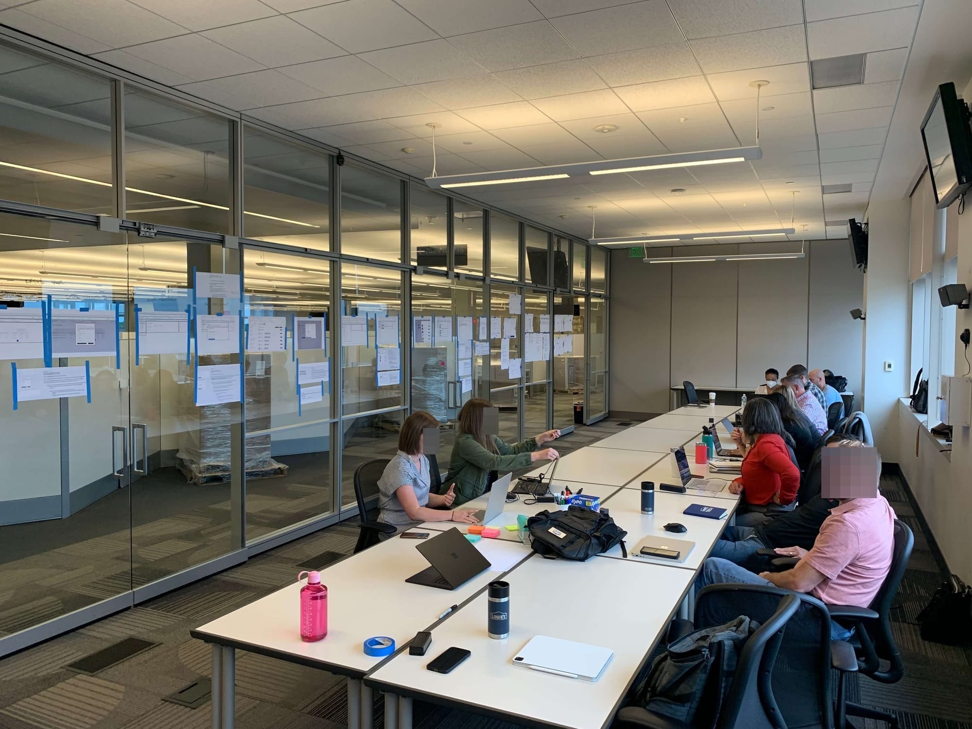
Introduction
In January 2022, I was the design lead for the shopping vertical at Lowe's because of my successful record in previously managing complex Pro product portfolios’ design work. Therefore, the senior director of UX asked me to lead an executive-sponsored project to modernize and overhaul Lowe's flooring installation sales experience.
Customers had expressed frustration with the current flooring shopping experience. They told us they didn't feel the money they spent on a flooring install reflected the value Lowe’s delivered; in addition, they were dissatisfied with how hard it was to schedule an installation. As more negative customer feedback started to pile on, it became clear that the sales experience needed to be modernized as quickly as possible, as the flooring installation services generated approximately US$250M* in sales.
The service line of business was important to Lowe's. It was a strategic theme going into FY2022 to increase sales revenue and cut operational costs. Creating a target state to overhaul the flooring service experience would pave the way for the entire Lowe's service experience to be overhauled based on our modernization project. Lowe's universal services LOB generated approximately US$5B* in sales and was an important part of Lowe's strategy to generate new sales revenue.
The executive sponsors for this project were Gary White, VP of Pro Sales & Services, Tim Baker, VP of Technology (Store Shopping), and Jeff Damien, VP of Product & Technology. The senior director of UX provided me with a design team of one lead product designer from the purchase vertical, four senior product designers, one product designer, a UX researcher, and a copywriter to assist me with modernizing the flooring installation customer experience. I was allocated approximately 16 percent of our design organization resources to complete this project.
My team of eight and I were entrusted with the time-sensitive and complex project of modernizing the flooring installation purchase experience at Lowe's. This project was crucial and was the store technology organization’s number one priority FY2022, as it directly affected the shopping, purchase, and post-purchase product teams.
My primary role was to spearhead the project and deliver a seamless, unified customer experience target state tailored to the flooring installation purchase journey. I worked closely with senior management for eight weeks to understand our business objectives and KPIs. During that time, we conducted a prioritization workshop to identify the themes and specific opportunities we wanted to pursue. Then, I created screen flows for senior management’s review, ensuring alignment on the target state I would work on.
This approach enabled my team of eight to identify and address the key opportunities for improvement effectively. Starting in February 2022, I led my team through a six-week program of intensive five-day design sprints to create a reimagined target state for the flooring installation customer and associate experience.
My leadership and management drove significant outcomes across the entire Lowe's technology organization. I successfully developed and presented a target state that featured improved design patterns specifically for Lowe's internal application. I reduced the use of legacy software tools, streamlined the quote-to-process, and cut the turnaround time significantly, simplifying the customer and user experience and marking a significant step forward in our pursuit of customer service and product design excellence.
*Financial numbers are estimates.
Timeline
In 2021:
- December: Discovery of business problems and customer frustration
In 2022:
- January: Senior management preparation and prioritization workshop
- Feb - March: Six weeks of five-day design sprints reimagining the target state
- March - April: Target state synthesis
- May: Target state stakeholder three-day workshop
- May: Implementation of target state
The business problem
Customer frustrations
Our customer satisfaction metrics highlight key areas for improvement in our business. Our “likelihood to recommend” (LTR) score was in the 80s, but our goal was to elevate it to the 90s. Worryingly, only 45 percent of customers expressed satisfaction with the 'project cost' of their installation, indicating a pressing need to enhance Lowe's value.
Another critical issue was the prolonged duration from measurement appointment to installation purchase, which averaged 22 days. This gap was excessive and needed to be reduced. Additionally, just 55 percent of customers were satisfied with the ease of installation scheduling, signaling a significant area for operational improvement.
The numbers
- We aimed to improve the services shopping and installation experience of the “do-it-for-me” (DIFM) customer segment.
- The installation services LOB generated approximately US$5B* in sales and was an important revenue driver for Lowe's.
- The target state would impact the flooring installations business, which generated approximately US$250M* in sales.
- The target state would affect over 1M of flooring sales quotes and streamline the sales process.
*Financial numbers are estimates
Internal misalignment
With so many different product teams working on the broader Lowe's installation services customer experience, disagreements surfaced around what constituted a project. Was a lead a project? Did creating a customer sales quote constitute a project? Or was the sales quote part of a project that wasn't active yet? Many teams and individuals had differing opinions, but creating a target state forced us to finally answer that question and line up across the technology organization.
Technical challenges
- The shopping journey was in Lowe's My Red Vest application (MRV).
- The post-purchase journey was in third-party applications and legacy UI.
- We had to migrate the UX and UI post-purchase capabilities from legacy UI and software tools to the MRV application.
Business objectives
Increase revenue:
- Improve cycle time from shop-to-quote to install.
- Reduce steps and redundancies in the quote process.
- Improve overall customer satisfaction.
Reduce costs:
- Drive operations efficiency and label savings.
- Simplify Lowe's associate experience.
Desired target state
Improve the following areas of the customer and associate experience:
- Improve the home-measure visit experience.
- Create a new build-sales-quote experience.
- Improve the installation experience.
- Create a new home project creation experience.
Understanding our customers
At the heart of a customer-centric organization is a customer experience program with a customer experience and journey map as its foundation. I could not have completed this difficult project without a detailed understanding of the customer and the Lowe's associate, so having built the omnichannel journey map ahead of time kept me two steps ahead. There were no surprises, which helped me stay on schedule throughout the project.
Customer experience map
We created a customer experience map for the senior management team, showcasing a more precise view of the customer experience areas that required a reimagined target state. This process eliminated data overload and kept us focused on what areas required our time investment.

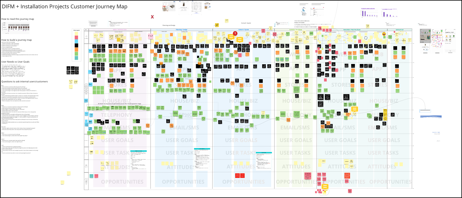
Customer omnichannel journey map
I built a “do-it-for-me” (DIFM) customer omnichannel journey map, which helped me pinpoint the channels and their associated touchpoint areas that needed to be reimagined for our target state.
I also used this journey map to build the customer experience map that showed the acute areas requiring an investment.
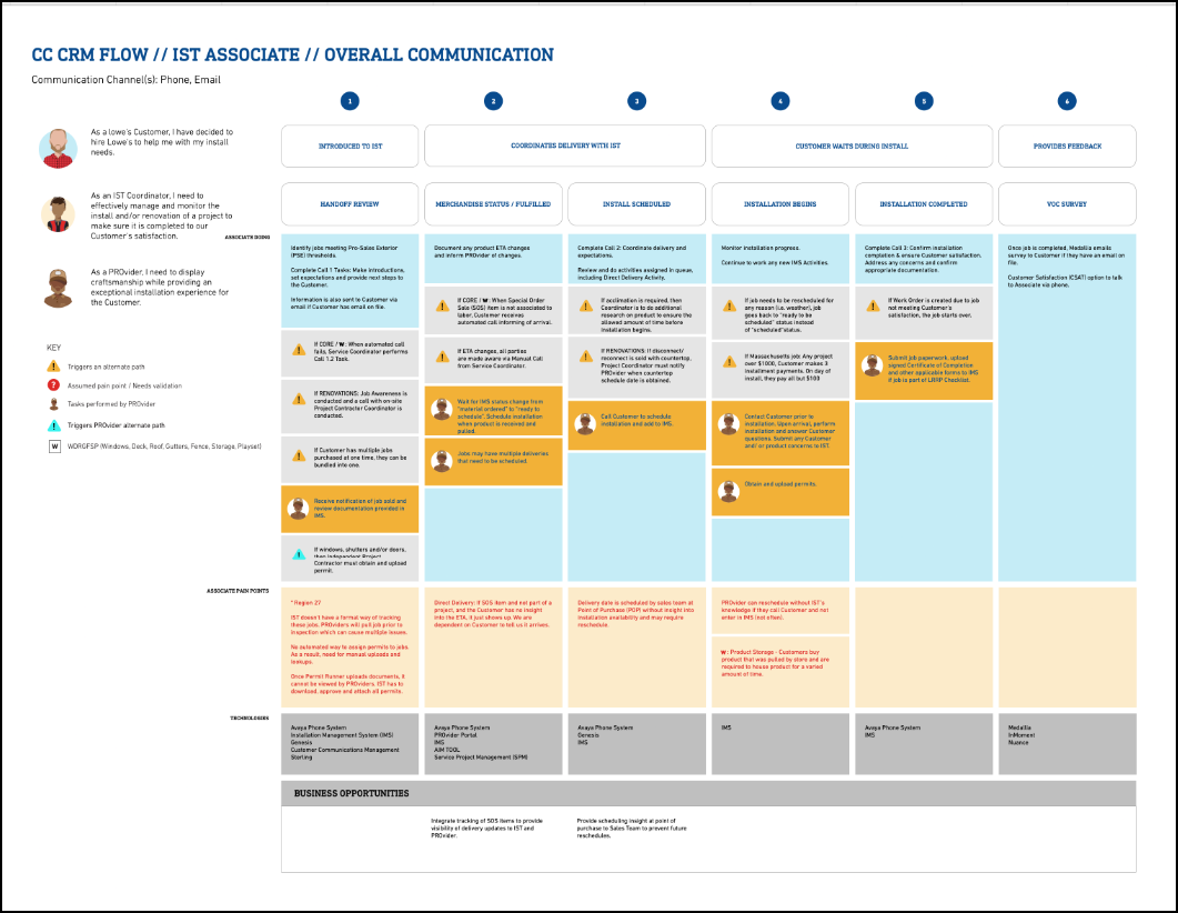
Lowe's installation service team - service map
One of the design teams participating in this project created a service map of the different steps Lowe's associates had to take to create sales quotes and how they managed installations. Having a service map to help fill the complicated quote-to-sale associate experience gaps was great.
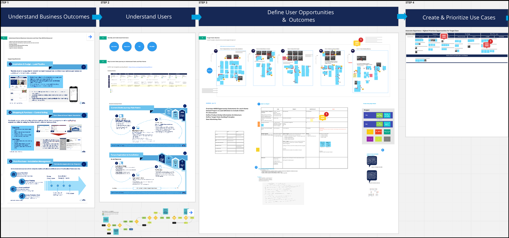
Prioritization workshop
To prepare for the design sprints stage starting in February 2022, I spent around six to eight weeks working with senior management to determine the specific themes and associated opportunities we would target during those sprints.
This workshop aligned the senior team on what was important and where my team should focus during our design sprints. I found this workshop beneficial and listened carefully to the VP’s insights and feedback.
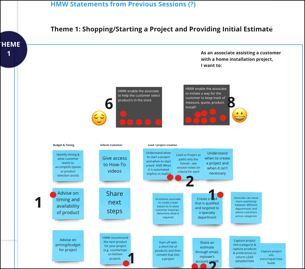
Identifying themes
I wrote how-might-we (HMW) statements for each customer experience area that we were looking to improve and for which we wanted to create a target state. The senior team and other team members voted on which HMWs required intervention. Then, we brainstormed possible ideas to improve the experience. We then dot-voted on which ideas seemed worthy of re-imagination.
Screen flows
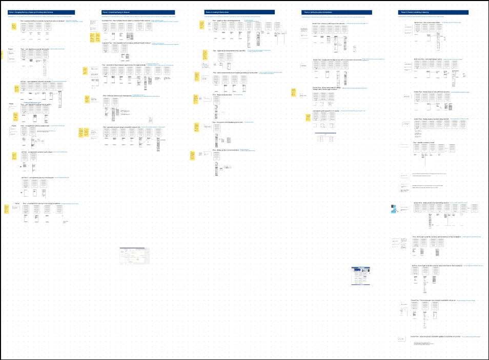
Instead of jumping directly to the design sprints, the senior team requested I build simple screen flows of all the opportunities we had chosen to explore. They wanted an early look at the potential user and customer flows we would target for improvement. Working through this exercise took me eight business days. The senior team found it helpful and gave me the green light to craft my project scope and details.
Specific screen flow
I kept the screen flows very straightforward, making it easy to present to the senior team.

Project management
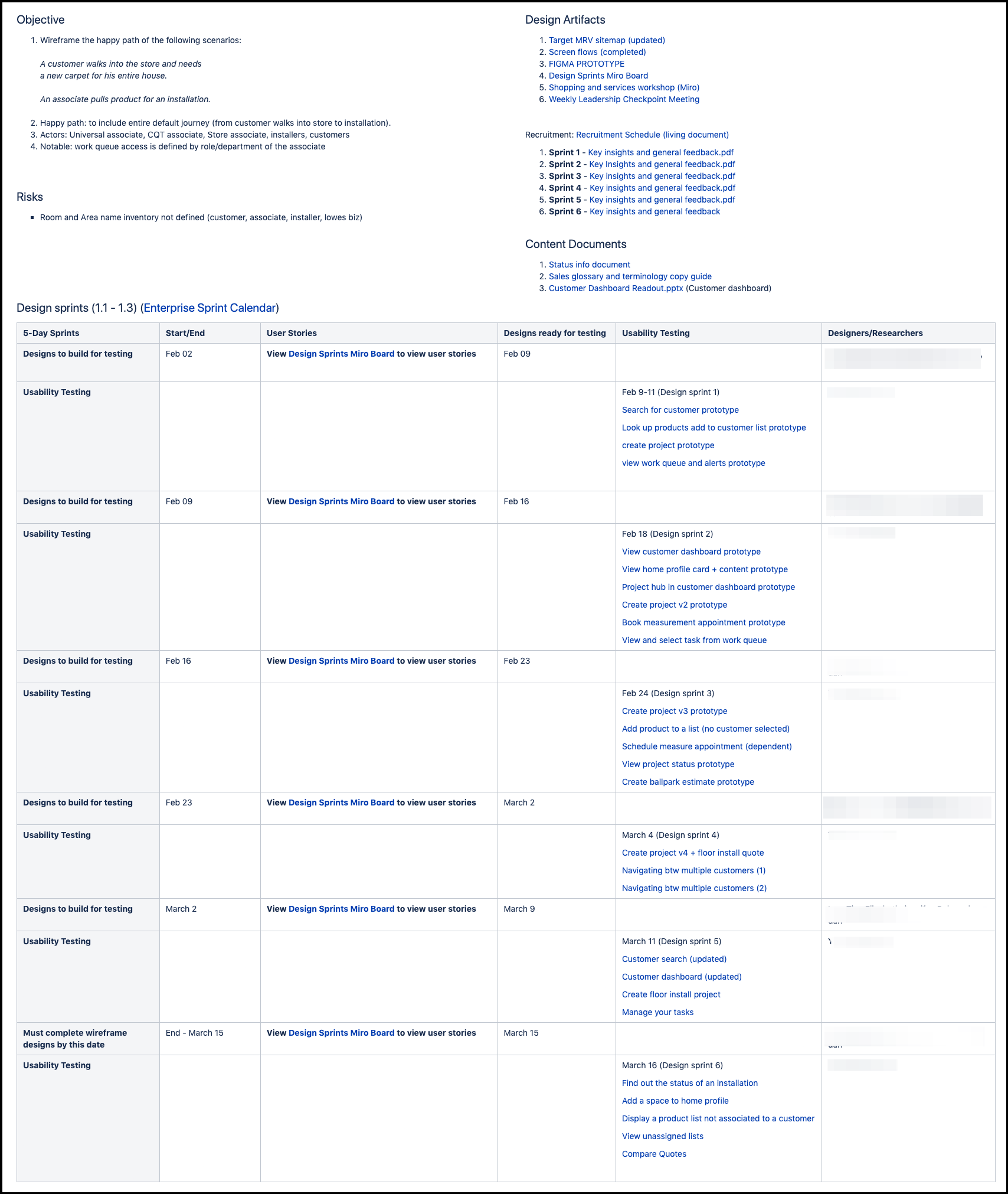
After spending six to eight weeks working with the senior team to fully understand this modernization project's scope, I was given permission to proceed and write my plan for the design sprint stage, as follows:
- I would execute six design sprints, each five days in length.
- At the end of design sprints, we would have scenarios ready for usability testing.
- The UX research would record the usability tests and provide a readout of the results.
- Every week, I would provide the senior team with an update on our work status.
Before starting this state of the project, I realized we might have some challenges working through such a heavy workload in such a short time. The designers allocated to this project were untested and had not participated in design sprints of this magnitude. I knew I could rely on the lead product designer, who was there to support me and help push the team to the finish line; however, I had some concerns going into this stage of the target state project.
5-Day design sprint
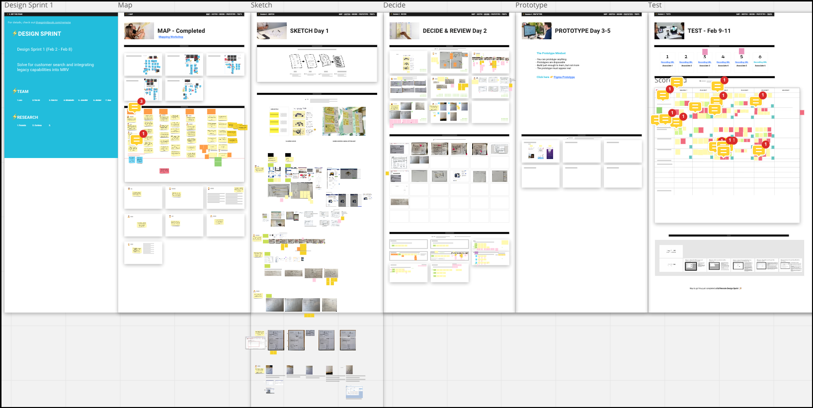
I used the Google Venture Design Sprints template from Miro. However, I modified the template to accommodate seven designers and how-might-we statements. Please note that this design sprint workshop was part of a much larger CX process and does not stand alone.
Someone may look at this step in the process and think, “Oh, this doesn't look complex.” Well, first, design sprints are meant for small teams, not seven designers—that's a huge difference. I also connected the design sprints to the prioritization workshop centered on the customer journey map.
The reason I mention this is because sometimes people tend to simplify everything, including design sprints. For some reason, they don't take them seriously, or they consider them easy, lightweight exercises. In managing this project, I realized that when you have a group of designers with wide-ranging skills, you need this type of workshop. Otherwise, you’ll get stuck very quickly in the ideation stage of creating target states.
Steps:
- Sketch
- Decide & Review
- Prototype
- Test
Solving the core problem
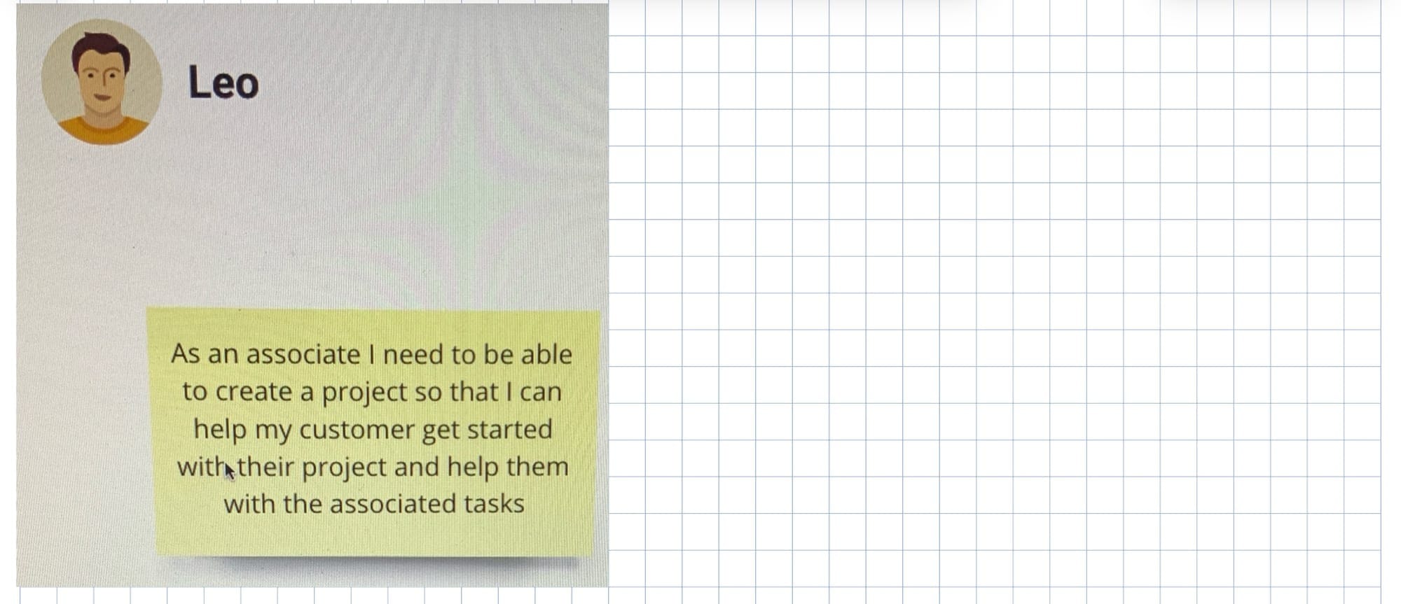
Besides managing this project, I took on the most difficult part of the experience and tried to answer the following questions: 1) "What is a home improvement project?” 2) “How should it be displayed in the UI?” and 3) “How would the design patterns work for that area of the user experience?” I worked on the core design patterns, and the rest of the team worked around them. All design patterns were to fit together at the end of the six weeks.
Managing this entire project was a lot of work. I typically worked till 11 p.m. or midnight during the week to stay on top of it.
The project's UX and UI were central to the target state
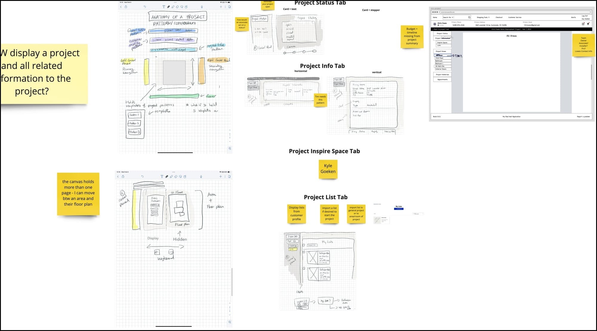
Example of sketching solutions
We could ideate our ideas by quickly sketching and narrowing in on them.
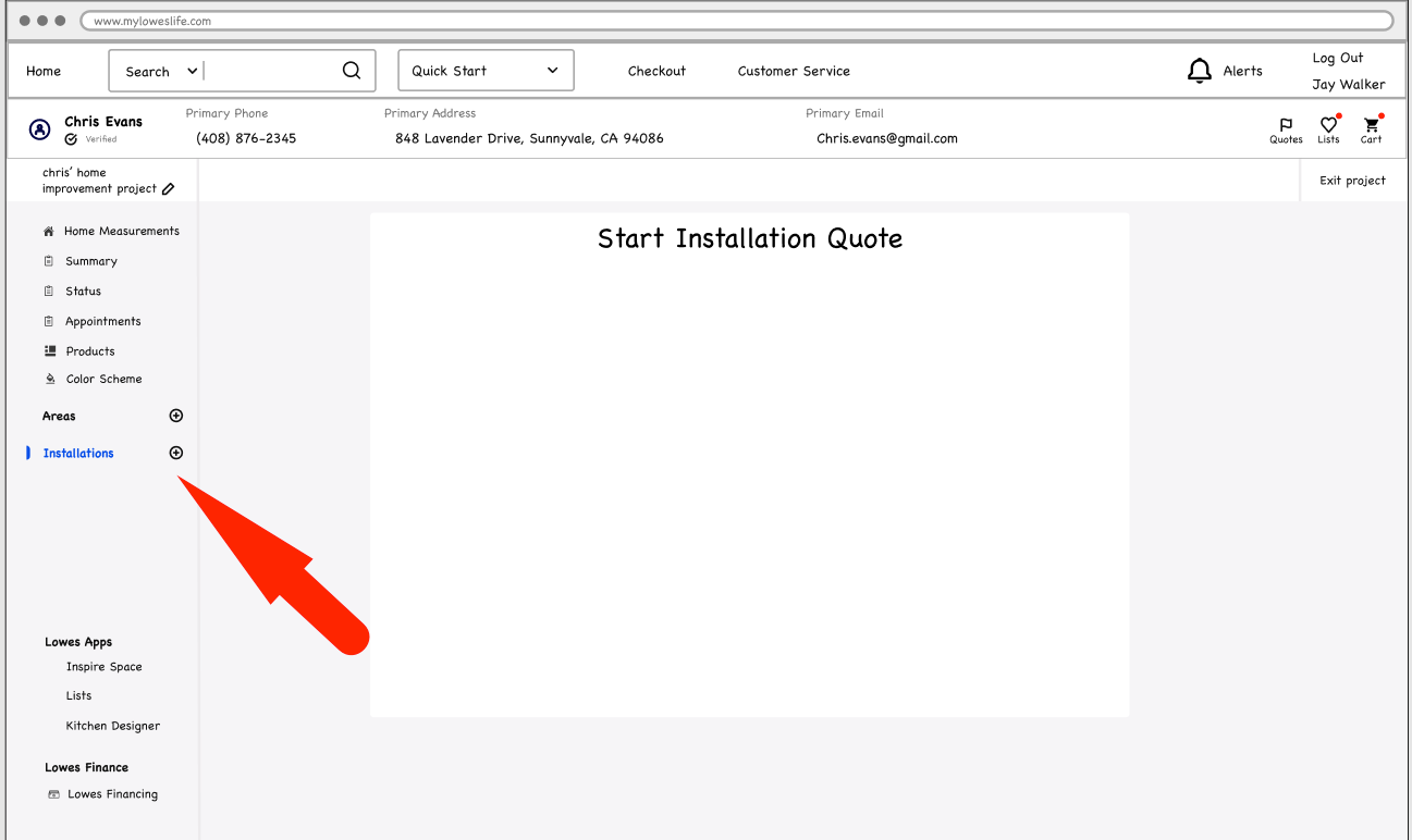
Designing a solution for a home improvement project UI
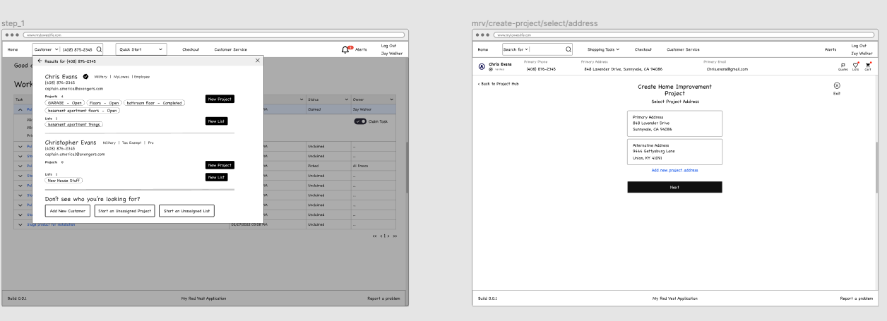
Examples of wireframing in Figma
We stuck with wireframing and avoided the high-cost, high-fidelity approach to work through our sprint backlog quickly. We designed around scenarios and worked through the user-flow details.

Sequencing net-new design patterns
We identified new design patterns and evaluated them as a group. Introducing new design patterns was a big deal because it meant an investment from the engineering team to get them into Storybook.
Usability testing
Sometimes, designers would work on their own scenario or work together on a scenario and prepare it for usability testing. We wanted to get our new experience from Lowe's associates and customers quickly.
Scenario-based testing of Figma wireframes
The UX researcher reviewed the scenarios with us during each sprint and write a user test. The usability testing occurred while the rest of the design team started their next sprint.

The researcher conducts tests in usabilitytesting.com
After every usability test, the UX researcher linked the recording to our Miro board. I also linked the recording to my Confluence page, where I managed the project.

Usability testing results
We used a scorecard to track all the users’ feedback throughout the design sprints. Seeing what worked and what was unclear or failed to meet the users’ expectations was insightful.
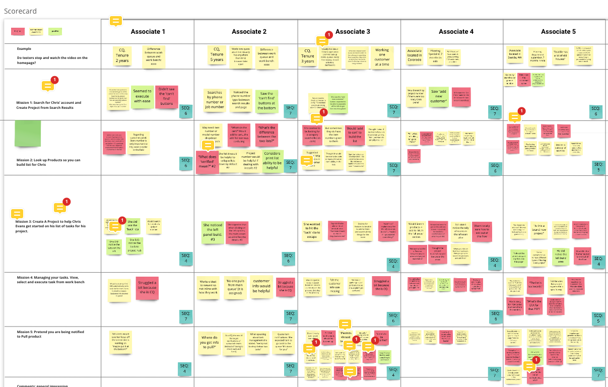
The target state
This project aimed to create a target state of the flooring service’s customer and associate experience. We wanted to display an improved experience that would meet our customers' and associates' needs and expectations and ultimately solve the business problems.
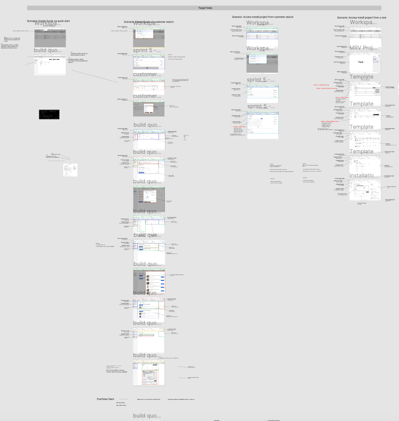
Target state with new design patterns in Figma
First, I created the target state in Figma as well as full-page templates.
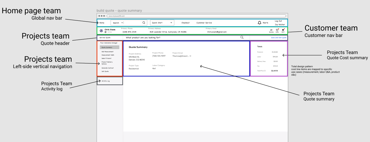
Page templates with design patterns
I broke down each page template and the design patterns on it. Then, I mapped the responsible teams to the individual design patterns.
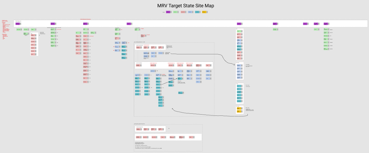
Target state site map
The target state designs would become part of Lowe's My Red Vest (MRV) application. I had to show all stakeholders how the target state would be integrated into the MRV application.
New design patterns
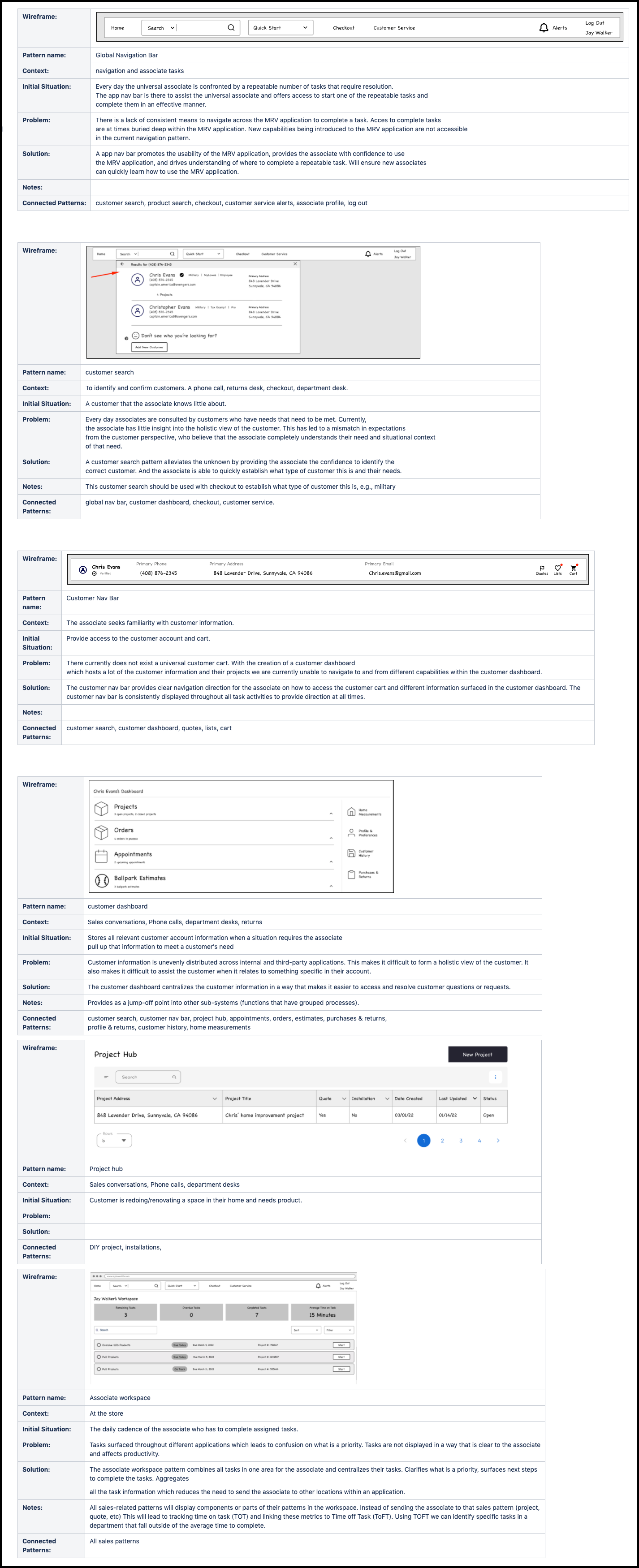
An important part of the target state work was how I managed the net-new design patterns created as part of our design sprints. I read a book on Pattern Theory and created a pattern template to describe each new design pattern. This exercise helped teammates discover why these design patterns were created.
This method of describing design patterns significantly sped up the product development process.
Target state synthesis
After I wrapped up six weeks of five-day design sprints, I needed a week to catch my breath and rest mentally. Being in this creative mindset for six weeks was both exhilarating and exhausting. Working remotely added strain because I had to spend a lot of time on camera working through problems with the design team.
In hindsight, it would have been a good idea to run the first sprint together on site and then continue as a remote team. A kickoff on site would have made it easier for all the team members to ask questions and get comfortable with what we were about to do.
I spent a lot of my time building out the target state in Figma and developing the Figma file that would display the target state’s full-page templates. I also spent time updating the MRV application site map, so I could paint a picture of where the improvements would be occurring and who would be responsible for shipping the target state design patterns.
Target state presentation
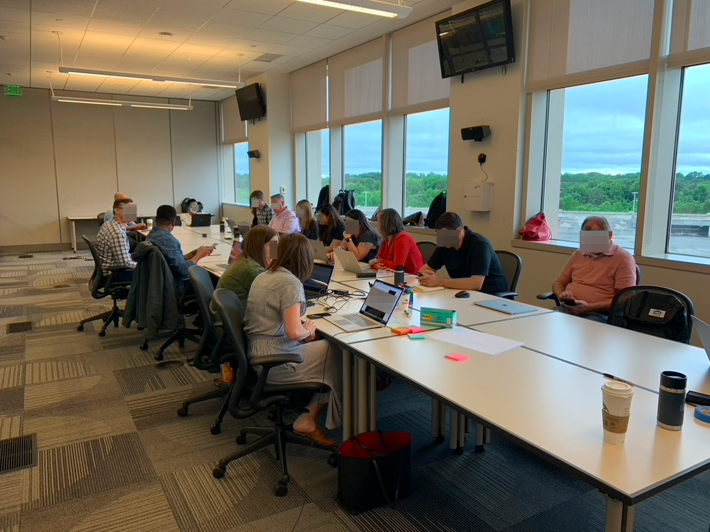
In early May 2022, stakeholders flew to Lowe's headquarters in Mooresville, NC. In a three-day workshop, I presented the target state to all the relevant stakeholders across Lowe's technology organization, walking them through it and how it might impact their product area.
This project’s size and scope were reflected in the number of stakeholders that came to inspect the target state. During the three-day workshop, we generated more than 30 use cases that different product teams would work on in their immediate product roadmap, or in some cases defer to the FY2023 product roadmap.

Product development
A target state with an updated user experience and its design patterns will get you to 90 percent clarity on the user requirements so you can design and ship the product improvements. You work out the last 10 percent when you review them more closely and write user requirements for them.
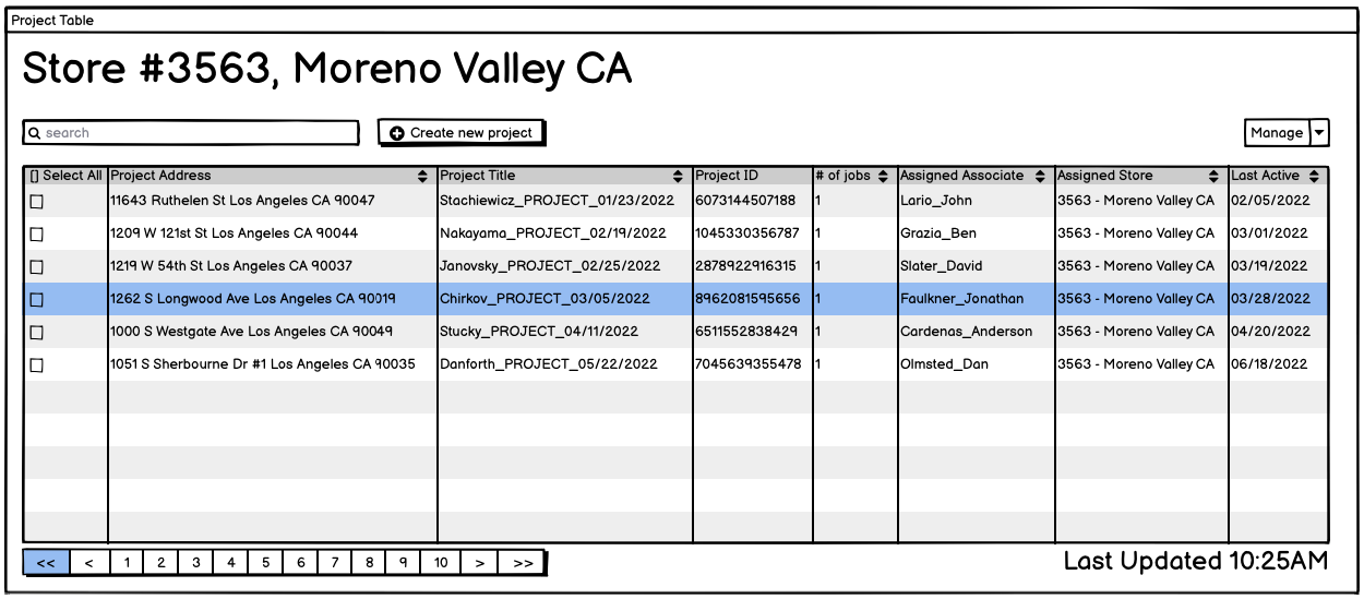
Example of specific design pattern added to the product roadmap
I used Balsamiq to work through all the different states for some of the new design patterns. Speed matters, and Balsamiq is an easier tool than Figma to work through a design pattern’s iterations.
Writing user stories to implement design patterns
I wrote user stories for all the new design patterns. This process was simplified because the users had shaped the design patterns and put them through collective stress tests, so they were well understood. Good wireframes displaying the different states made detailed requirements easy for the engineering and design teams to assess.

Summary
When the services business team asked the technology team for help, they selected me from among the design and product leaders to lead the project and bring it to its successful conclusion. I’m pleased to say I got the job done.
I spent eight weeks with senior management to prepare for the design sprints. During that time, I reviewed the business objectives and the customer frustrations and analyzed the data and the customer journey map until I had enough clarity to move forward and add the right opportunities to the prioritization workshop.
After the senior team and its members completed the prioritization workshop, I spent eight days building the screen flows to help drive alignment and clarity among the senior VP team. Then, I crafted my project outline and the design sprint schedule and organized the eight-person design team’s cadence for achieving the target state.
Once the senior team gave me the green light, I worked for six weeks to modernize the current state of the customer and associate experience. During the design sprints, I migrated half of the target state experience from the legacy software tools to the modern My Red Vest Lowe application. I connected and streamlined the sales process in six weeks to give the product teams enough work for two years.
After the design sprints, I spent several weeks synthesizing the results and creating three documents:
- Full-page templates with all the new design patterns in a Figma file, mapped to each product owner.
- A sitemap of the target state and what had changed during the project.
- A presentation for senior leadership about the proposed changes.
I then met with the SVP of technology to discuss the target state.
Once concluded, I presented my findings to the many stakeholders across the Lowe's technology organization in a three-day workshop at the Lowe's headquarters in Mooresville, NC. This event led to over 30 use cases being identified and added to the product roadmap for FY22 and FY23. In the end, I thanked all the design team members I had worked with for their hard work, and we moved on to implementing the target state.
Reflections and details
- I delivered the target state in six weeks, which was unheard of by Lowe's standards. Past attempts had been made to modernize aspects of the installation experience's sales process, but they had all stalled. People were shocked at the amount of work completed in such a short time.
- The group of people with the skills and expertise to successfully create target states to improve large areas of a customer experience is very small. Many skills need to be combined to manage a project of this type, so you need very senior and experienced leaders to accomplish the task. I wanted to reach out to other senior design leaders, but nobody had done this type of project at this scale at Lowe's.
- Some of the designers experienced the Dunning-Kruger effect and overvalued details. I had to work hard to rectify this bias and steer them in the right direction.
- The target state stakeholder workshop was a testament to this modernization project’s scope. The target state easily generated 30 use cases for product teams across Lowe's technology organization.
- Every company of a certain size needs a small team capable of creating target states for a customer segment and their customer experience. This capacity is one of the only ways to move the needle and go beyond the incremental improvements that have plagued F500 companies in recent years.
- Working together to create a future state is extremely difficult because most people struggle to hold parallel experiences in their heads. Also, weighing the pros and cons of those parallel experiences without ever having drawn them out is very challenging.
- Systems thinking allowed me to break down the target state into smaller chunks and distribute the workload across the design team. Although this proved a successful method, it strained the design team because they wanted to see the big picture first. The project didn’t have the extra time built in to walk the design team through the big picture, so designers struggled to focus on the smaller chunks.
- Six straight weeks of design sprints exhausted the design team, which led me to realize that lead or principal-level product designers with relevant experience would better fit this type of design work. Or, I should have had the kick-off in person and on site to get everyone on the same page faster.
- I remain deeply committed to the statement, “Professionals focus on process. Amateurs focus on the outcome."
Type: Target state project
Date: 2022
Company: Lowe's
Role: Lead Product Designer
What I did: Digital customer and employee experience strategy, data analytics, customer feedback, target state process, managing and leading complex target state projects, design project, journey mapping, customer experience mapping, omnichannel integration, data analytics, improving touchpoints, wireframing, UX design, design sprints, usability testing, design scenarios, service design, design patterns, and product development.
Team: Lowe's Core UX design team
Tools: Figma, Balsamiq,, User Testing, Miro, Confluence
Workshop: Google Venture design sprints, prioritization workshop
Get in touch
Thank you for visiting my case study. Please contact me if you want to discuss any of my case studies and see an opportunity to work together.
Written by Leo Vroegindewey, Principal Product Designer.
Let's connect if you think I can help you. Email me.